"George, those redneck aliens down the street are at it again! Drunk as skunks at twelve noon and screeching at each other right in the front yard! Just look at them! Dilapidated house, bare, lifeless lawn, spent uranium rods strewn everywhere. Five warp cruisers in the driveway and not a one of them runs. They've even got a rusted out old spaceship up on cinder blocks in the front yard. It wouldn't surprise me if they were cooking space meth in their bedroom! We'll never sell this place with them down the street!"
Based on a doodle in my sketchbook. I actually drew this one twice. Here's the first version below:
I finished the first drawing, stepped back and looked at it, and just wasn't happy with it. His pose was too static and dull, and his body just didn't look right. His head was OK though.
So I sketched him out again, giving him a lazier posture and a third arm for more alieny goodness. I liked the new sketch, so I redrew him based on it.
Drawn in Photoshop on the graphic tablet.
Thursday, April 29, 2010
Ad Fail
This caught my eye on Yahoo today. It's an ad for some ADHD drug for kids called INTUNIV. In the ridiculously lengthy litany of side effects, it says, "Your child should not drive or operate heavy equipment until you know how INTUNIV affects your child." Sloppy grammar, but good advice just the same.
So remember moms, after you dose little Timmy, don't let him drive the truck down to his job at the construction site. Safety first!
Monday, April 19, 2010
Demon Dash
Outta the way, one side, comin' through!
Hey, it's another vector drawing. It took me a while to warm up to vector, but I'm kind of starting to like it. I doubt I'll ever abandon bitmap drawing for vector, but it's fun to dabble in it now and then, and it's another tool in the arsenal.
I just realized this drawing has the exact same color palette as this one. Stick with what works, I guess.
The vector demon and background were drawn in InDesign. I imported the drawing into Photoshop where I roughed up the edges of the background a bit, something that vector just can't do.
Here's the original sketch.
DVD Doppelgangers: Another Woman
I decided to tweak the format of DVD Doppelgangers a little and place the examples side by side instead of several vertical inches apart, something I should have done from the start. See, even DVD cover mockers make mistakes sometimes.
Anyhow, today's entry is Another Woman's Husband (2000) vs Wild Things (1998).
I'm pretty sure Another Woman's Husband is a Lifetime Channel movie, which explains why I've never heard of it. Despite the copycat covers, the two movies have absolutely nothing in common. It's the gripping tale of a woman trying to overcome her fear of water after witnessing her brother drown, while Wild Things is the story of a teacher accused of raping his student.
Another Woman's Husband successfully copies pretty much every element of Wold things; you've got your two sultry sirens peering seductively out of the water, the actor credits strung across the top, even a male figure at bottom center. They even copied the colored banner placement at the top! The only difference between the two is the placement of the title and the font. Kudos to the designer! You copied 80% of an earlier, better layout!
One more thing: On the Wild Things cover, I can't help but notice that Mr. Matt Dillon appears to be auditioning to be the new scoliosis poster child.
Thanks to my pal KW Monster for pointing out these covers to me!
Saturday, April 17, 2010
Cloudy With A Chance Of Tentacles
This drawing started out as a sketchbook doodle of a little monster guy staring up. When I was drawing him for real, it felt like I should show what he was looking at, so I thought, "Tentacles, of course!"
Things I learned drawing this illustration: drawing tentacles is hard. Luckily I draw a lot of monsters, and they never, ever have tentacles.
Seriously, those tentacles gave me a lot of trouble. At first I was drawing them very thin and skinny, and no two were touching one another. It made for a dull and lifeless layout. Next I tried draping some of the tentacles over others. That helped a bit, but it still just didn't look right.
Finally I got the idea to make them thick and plump looking, almost like earthworms rather than tentacles. That finally worked (well, for me anyway).
Drawn in Photoshop on the graphic tablet.
Here's the original much simpler sketch.
DVD Doppelgängers: New Moon Vs. Neowolf
It's time for another edition of America's Favorite New Game, DVD Doppelgangers, in which I call out art directors who deliberately copy DVD covers and posters of popular movies, hoping to fool the public into buying their knock-off version.
Tonight we have the 2010 movie Neowolf. It's the story of a struggling musician who has to choose between his career and his girlfriend. He ends up joining a band full of werewolves. Or something like that.
I know absolutely nothing about this movie, but according to IMDB the director was Alan Smithee. That tells me all I need to know and more. Mr. Smithee has had quite a career over the years, directing literally thousands of horrible movies.
Now let's look at the theatrical poster for New Moon, which also just happens to feature teen werewolves. The Neowolf studio did an outstanding job of reproducing virtually ever facet of it.
Credit to the New Moon designer for at least knowing that werewolves prefer a full moon. The Neowolf werewolves have to settle for a paltry crescent moon.
Tonight we have the 2010 movie Neowolf. It's the story of a struggling musician who has to choose between his career and his girlfriend. He ends up joining a band full of werewolves. Or something like that.
I know absolutely nothing about this movie, but according to IMDB the director was Alan Smithee. That tells me all I need to know and more. Mr. Smithee has had quite a career over the years, directing literally thousands of horrible movies.
- Did You Know? Alan Smithee is the fictitious name that studios list as the director when a movie turns out so badly that the real director refuses to attach his name to the project. Any time you see "directed by Alan Smithee" in the opening credits, you'd be well advised to exit the theater in an orderly manner or turn off the television and back slowly but steadily away from it.
- Sepia toned color scheme? Check!
- Three sexy teens with sultry stares, all dressed in black? Check!
- Spooky forest setting? Check!
- Yellow moon in the night sky above? Check!
- The word "Neo" even means "new," for poop's sake! So really the title is New Wolf, which is miles away from New Moon.
Credit to the New Moon designer for at least knowing that werewolves prefer a full moon. The Neowolf werewolves have to settle for a paltry crescent moon.
Thursday, April 15, 2010
J. Emerson Handstandish
My poor blog feels kind of neglected lately. I've been outside a lot this month doing yard work and such, so I haven't had much time for blogging.
But enough about my terribly interesting yard. Here's an illustration based on a doodle in my sketchbook.
Drawn in Photoshop on the graphic tablet.
Here's the original sketch.
But enough about my terribly interesting yard. Here's an illustration based on a doodle in my sketchbook.
Drawn in Photoshop on the graphic tablet.
Here's the original sketch.
Criminally Unfunny
I saw this DVD in Target today, and something about the cover image seemed familiar...
Oh yeah, now I remember where I've seen it before.
Back in 1978, Tim Allen Dick (or Tim Allen, as he's known to you and me) was arrested for possession of cocaine. He could have been sentenced to life in prison (!), but turned state's evidence and ended up serving 28 months in federal prison.
I can't help but wonder if filming this movie dredged up some unpleasant memories for him? If I was an ex-con I sure wouldn't want to put on an orange jumpsuit again just to film a dumb movie. Well, maybe if they backed a semi-truck full of money to my house.
This is another one of those Frankenstein covers. I'm willing to bet that not one of the seven people on the cover were photographed in the same room. Maybe not even on the same continent. The light is hitting every character from a totally different angle, the color tones are different for everyone, and Ray Liotta was even filmed outdoors, squinting under a noonday sun!
I'm assuming that all of the background figures are supposed to be staring at Mr. Allen, but they're all failing spectacularly. Not one of them is looking anywhere near his general direction. Shooting the actors separately like this and then combining them in Photoshop never, ever works, but that doesn't stop Hollywood art directors from doing it over and over and over.
Saturday, April 10, 2010
Nelson J. Platypus
If I had a pet platypus I think I'd name him Nelson. That just sounds right for some reason.
The only known mammal that lays eggs. Proof that nature doesn't know what the heck it's doing.
Drawn in Photoshop on the graphic tablet.
Here's the sketchbook doodle of the platypus. Note that originally he wasn't holding and contemplating an egg. I remembered the whole "mammal that lays eggs" thing as I was drawing him, so I added his egg holding arm. Now instead of just standing there, he's contemplating his origin.
Friday, April 9, 2010
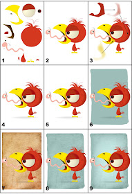
Oily Boid Step-By-Step Guide
Several people (OK, one) have asked how I did the Oily Boid vector drawing, so I thought I'd make step-by-step how to guide. You'll probably have to click on the image and enlarge it to see the details.
Step 1:
Here are the various shapes and parts I drew to make the bird and worm. I used the mouse this time, not the graphic tablet, to draw the parts in InDesign. Note that I didn't actually draw all the parts strewn about the page this way; this exploded view is just to illustrate the pieces that make up the character.
Step 2:
I drew various shapes and colored them until I had a reasonable facsimile of a cartoon bird and worm. Note that the colors are all flat at this point, with no shading.
The biggest challenge in doing vector as opposed to bitmap drawing (for me, anyway) is the planning involved. When I do a bitmap drawing, I jump all around the character. I start with the eyes or nose, move on to the head, then the body, back to the mouth, etc.
With vector it all has to be planned out. You make the head, then the eyeball, then the iris, then the pupil, then the highlight. You can't jump around or you'll end up with a piece underneath another. It's like putting together a model kit or a puzzle.
Step 3:
To add shading, I drew darker colored shapes over the various parts of the characters. At the top of the frame is the shape I drew to shade the bird's head. Again, I didn't really draw the shading up at the top of the page like that, I drew it directly on top of the bird's head. I set it up there in order to be seen better.
Once I got the shape and coloring right, I feathered the shape in InDesign to give it a softer edge. You can feather shapes a little or a lot; there's no set formula. I just eyeball it until I think it looks right. Once the shape was feathered, I cut it and then placed it inside the bird's head.
Step 4:
I continued to add shading to the rest of the bird and worm. I also added a shadow under the bird.
Step 5:
Once the shading was done, I added details to the characters. Things like feathers on the bird's body, spots on his beak, lines on his legs, etc. I also added segment lines and white highlights to the worm.
Step 6:
Next I used InDesign's pencil tool to draw an irregularly shaped background. I played around with the color until I thought it looked right.
Step 7:
Then I placed a grungy bitmap texture into the drawing.
Step 8:
I then placed the bitmap inside the green background shape, and used InDesign's blend settings to combine the two. Again, there's no real formula for doing this; I just play with the settings until I see something I like.
Step 9:
I thought the background was a little dark, so I added a white shape to the center and feathered it so it would have a soft edge.
Wednesday, April 7, 2010
Oily Boid
Hey, it's another vector drawing. It took me a while to warm up to vector, but I'm kind of starting to like it. I doubt I'll ever abandon bitmap drawing for vector, but it's fun to dabble in it now and then.
The bird, worm and shadow were drawn in InDesign. The green background was drawn in Photoshop, because InDesign doesn't do painterly effects that well.
3D, Or Not 3D
The current 3D virus that's infected movies and television has now spread to the internet. Today I went to Google Maps to get directions, and I accidentally clicked on Street View. While there, I noticed something new: in the upper left corner was an icon of a cartoon guy wearing 3D glasses. "No, it can't be," I thought. "They wouldn't. They couldn't!" I clicked on the little icon, and sure enough, Street View switched from 2D to anaglyph 3D. You know, the kind that requires the glasses with the red and blue lenses.
Holee. Crap. Google Street View is now in 3D. That's my house there, in glorious three dimensions. We truly live in a wondrous, if mystifying age.
I have no idea when this feature was added, but I'm assuming it was very recently. I hunted up a pair of 3D glasses and was surprised to see that it doesn't look that bad. I think it's totally unnecessary, but that's never stopped Google before.
How they're doing this, I have no idea. 3D requires two separate images from slightly different angles. Have the Street View cameras been taking two pictures of everything from day one? Or are they doing this with some kind of 3D conversion software?
Next month I'm fully expecting them to add Google Sound and Google Smell to Street View as well.
UPDATE: Hmm. As of this morning (April 8, 2010), the 3D option is gone. I'm not seeing the little yellow guy with glasses anymore. Maybe it was just a test that I stumbled onto?
It really was an option for a week or so! I have witnesses!
UPDATE TO THE UPDATE: Thanks to Gretchen for pointing out that the 3D view is still there. If you right click on the image a popup menu appears, listing 3D as an option.