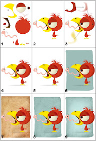
 Several people (OK, one) have asked how I did the Oily Boid vector drawing, so I thought I'd make step-by-step how to guide. You'll probably have to click on the image and enlarge it to see the details.
Step 1:
Here are the various shapes and parts I drew to make the bird and worm. I used the mouse this time, not the graphic tablet, to draw the parts in InDesign. Note that I didn't actually draw all the parts strewn about the page this way; this exploded view is just to illustrate the pieces that make up the character.
Step 2:
I drew various shapes and colored them until I had a reasonable facsimile of a cartoon bird and worm. Note that the colors are all flat at this point, with no shading.
The biggest challenge in doing vector as opposed to bitmap drawing (for me, anyway) is the planning involved. When I do a bitmap drawing, I jump all around the character. I start with the eyes or nose, move on to the head, then the body, back to the mouth, etc.
With vector it all has to be planned out. You make the head, then the eyeball, then the iris, then the pupil, then the highlight. You can't jump around or you'll end up with a piece underneath another. It's like putting together a model kit or a puzzle.
Step 3:
To add shading, I drew darker colored shapes over the various parts of the characters. At the top of the frame is the shape I drew to shade the bird's head. Again, I didn't really draw the shading up at the top of the page like that, I drew it directly on top of the bird's head. I set it up there in order to be seen better.
Once I got the shape and coloring right, I feathered the shape in InDesign to give it a softer edge. You can feather shapes a little or a lot; there's no set formula. I just eyeball it until I think it looks right. Once the shape was feathered, I cut it and then placed it inside the bird's head.
Step 4:
I continued to add shading to the rest of the bird and worm. I also added a shadow under the bird.
Step 5:
Once the shading was done, I added details to the characters. Things like feathers on the bird's body, spots on his beak, lines on his legs, etc. I also added segment lines and white highlights to the worm.
Step 6:
Next I used InDesign's pencil tool to draw an irregularly shaped background. I played around with the color until I thought it looked right.
Step 7:
Then I placed a grungy bitmap texture into the drawing.
Step 8:
I then placed the bitmap inside the green background shape, and used InDesign's blend settings to combine the two. Again, there's no real formula for doing this; I just play with the settings until I see something I like.
Step 9:
I thought the background was a little dark, so I added a white shape to the center and feathered it so it would have a soft edge.

This is so cool! I love the 1st photo with all the parts seperated, makes it so much easier to see what you were saying, I can't imagine how hard it must be to put each piece down in the right order! Maybe as difficult as say, learning to draw and use the software you need to create such art! Kudos to you for learning it and doing it well!!
ReplyDeleteThanks! It's not all that hard to do vector, but it sure takes a lot longer than bitmap art. Maybe if I stick with it I'll get faster.
ReplyDelete