As always, I started out with a rough sketch, just to get an idea of the layout and proportions of the characters. I drew this sketch in pencil, then scanned it and imported it into Photoshop, where I put it on its own layer.
I then added the actual text. For this project I let the amount of text determine how much room there would be for the image. I then added the rough-edged background to the page. Note that the background and the text are each on their own Photoshop layers. I use a ton of layers in my illustrations. Using lots of layers makes it easy to make changes and edits later.
Next, using the pencil sketch as a guide, I used my graphic tablet to draw tighter versions of Santa and the elf. Yep, this new drawing is on another layer.
Then I blocked in the basic background shapes and colors on a background layer. It might seem odd to start with the background, but it helps me better place the characters in their environment.
Once that was done, I used the tight sketch as a guide and started blocking out Santa's basic shape and colors on another layer. Once that was done I added shading to him.
Normally when I illustrate something, I draw the outline first and then color it in, much like in a comic book. But most Little Golden Book art was painted. Since I was trying to evoke that style, I had to give my book a painted look as well. This was the exact opposite of the way I way I usually work, and was tough to get used to.
Once I had Santa's shape painted in, I added all the details to his face, hair and clothing, again on a separate layer. As I said, backwards from the way I usually work. Note that his details are all drawn in black.
Once the details were drawn in, I locked that layer and painted over them to change their colors (for more on that process, see this post. I usually make the lines a darker color of the area they're covering, so if Santa's beard is light gray, then the detail lines are a darker shade of that same gray.
Coloring the details like this helps give the page that storybook look.
Then I added some red to Santa's nose and cheeks (on another layer) to help give the character some life. I added a shadow under his feet as well. The red and shadow were pretty dark, so I adjusted the transparency of the layer to around 20%, so that they'd lighten up and be less opaque.
Once I finished Santa, I put all his various layers into a folder in the Photoshop layers palette. Once everything was contained inside that folder, I could move it or change its size and all the layers inside it would follow suit, making adjustments much easier.
Next it was time to tackle the elf. Using the tight sketch as a guide, I blocked in his colors on a new layer.
Then added details in black on a detail layer.
Then changed the colors of his detail lines.
Then I added the red nose, rosy cheeks and shadows to the elf as well. And like I did with Santa, I placed all the elf's layers inside a folder for easier editing.
Next I made yet another new layer and added details to the molding on the background walls.
Next I added floor boards to the floor on a floorboard layer.
Then came wood grain on another layer. I drew the wood grain a very dark brown, then adjusted the transparency of the layer until I thought it looked right.
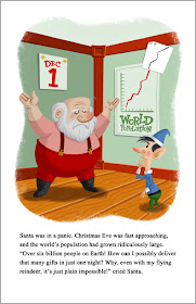
Next I added details to the walls, such as the calendar and the world population chart. I drew slight shadows underneath each object so they wouldn't look like they were pasted perfectly flat to the walls. As always, these were on their own layer.
Next I added details to the population chart, on another layer.
I stepped back and looked at the page and was fairly satisfied with it. Then I noticed that the characters seemed to be blending into the background. They weren't popping off the page. So I made a new layer and drew a white outline around each one to help separate them from the background a bit.
I thought the background was still a bit too intense, so I placed a new layer between the characters and the background and colored it solid white. Then I adjusted the transparency of this white layer until I thought the background was knocked back sufficiently.
The last step was to add yellowing and aging effects to the page, as if it were thirty or forty years old. Needless to say, these aging effects were on their own layers.
And voila! Only 20 simple steps from start to finish. Actually there were many more steps to drawing this page than I've shown here; these are just the major ones! Then I repeated the process eleven more times and before I knew it I had a book!


Very interesting process, thanks for sharing!
ReplyDeleteOh how I love a process post! What a difference that white outline and muted background make! As always, I love your attention to details. Awesome post!
ReplyDeleteThanks, guys! Glad you like it.
ReplyDeleteDawn: That's one of the great things about digital illustration-- if there's a problem you can easily try many different solutions without having to start all over.
This blog post itself was a huge job. You're gonna have to do a how-to post on how you post.
ReplyDeleteHaw! It wasn't that hard to make all the steps. I just turned off all the layers in the Photoshop drawing, then turned them on one at a time and saved them as jpegs.
ReplyDelete