That time is long past. Gone are the days when movie posters were beautiful examples of graphic design and illustration, and works of art in their own right. Classic movie poster design has been replaced by nightmarish collages, poorly stitched together in Photoshop.
Case in point: the Sony/Marvel Studios joint venture Spider-Man: Homecoming. The movie may be a critical and box office hit, but its marketing campaign is one of the worst I've seen, as each poster released is more appalling than the last.
Like this one, for example. Oy gevalt! Where do I start? Obviously this poster was deliberately designed to be bad, as it's supposed to look like a page from Peter Parker's personal scrapbook. Because scrapbooking is totally a thing that teens are into these days, right? Especially male teens.
It perfectly captures the amateurish look of something cobbled together by a person with no artistic talent, so in that respect it's actually successful.
But... why would any sane art director think this would be the perfect way to advertise a multimillion dollar movie from a major studio? It's like spray painting "DIAMONDZ INSIDE" on the outside of an upscale Beverly Hills jewelry store. I... I just don't get it.
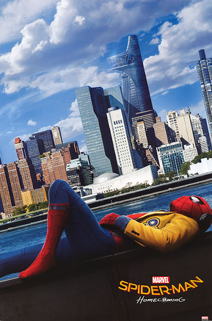
And then there's this one. At first glance it's better than the scrapbook poster, but it's got more than its share of problems as well. There's way too much dead space in the upper left corner, and it uses a really unappealing section of the New York skyline.
Worst of all, THERE'S NO ACTION! A movie poster's supposed to be electric and exciting! It should look like it's in motion even though it's a still image. This poster's so goddamned boring that Spider-Man fell asleep at the bottom of it! Does this poster make you want to see the movie? If he's bored by his own film, why would I want to pay to see it?
Plus he's inexplicably wearing his school uniform jacket over his costume. Yes, he does this briefly in the film, but there's zero context for it on this poster, which makes its inclusion beyond odd.
And to whoever designed this poster— tilting everything at a 35º angle in a desperate attempt to generate visual interest is the oldest trick in the book, and doesn't work here.


No comments:
Post a Comment
Note: Only a member of this blog may post a comment.