Showing posts with label dvd fail. Show all posts

Sunday, September 2, 2012

DVD Doppelgängers: Burn After Reading Update!

Way back in 2010 I first posted about the apparent popularity of the Burn After Reading DVD cover, which spawned at least two blatant imitations of which I was aware.


Here's the cover to refresh your memory. For the record I do like the retro look of the design, with the off-kilter photo placement and the hand-lettered logo. It's definitely an homage to movie posters of the 1960s and a welcome change from the Photoshopped clones that infest current multiplexes.

Apparently I'm not the only one who likes it, as two years later it continues to inspire DVD cover designers.

I was in the video store today and saw this. I'm sure that the designer didn't intentionally steal the Burn After Reading design for this project. I'm betting it's just a coincidence that it's exactly the same in every measurable sense. The fact that the actors' names written across the top, the character photos laid out in an off-kilter grid, and the logo in the center in a retro font (hard to tell if it's truly hand-lettered or not, as none of the letters are repeated)... no doubt it all came about by pure chance. Including the same red background.

HAW! Had you going there, didn't I? Drew you right into my trap. There's no way in hell this was anything but an intentional swipe. Someone was definitely under the deadline gun, couldn't think of a good idea and just reworked the Burn cover, hoping I wouldn't notice and call them on it.

I also saw this. Not quite as blatant as the Let Go cover, but it definitely shares some design DNA with the Burn cover.

Friday, April 15, 2011

DVD Doppelgängers: The Human Centipede Fest

It's been a while since I did a DVD Doppelganger post, so let's get right to it!

First up we have DVD cover of the bizarre and disturbing The Human Centipede. It's the heartwarming tale of a retired doctor who specialized in separating conjoined twins, and has now decided he can best serve humanity by stitching people together. He does this by kidnapping three victims, er... I mean test subjects and sewing them together, butt to mouth. No, that's not a typo. He literally sews the mouth of Person #2 to the anus of Person #1, and so on. What he was attempting to prove by creating his "human centipede," I have no idea.

Note that the box says that the movie is "100% Medically Accurate." It is too, if by medically accurate you mean "far fetched" and "peppered the script with some terms pulled from Gray's Anatomy." 

It's a very twisted and disturbing film, and definitely not for everyone. I need to do a proper review of it one of these days.

Next we have the movie Last Breath. I know absolutely nothing about this movie, except that the marketing team is really, really hoping that you liked The Human Centipede so much that you'll automatically want to watch this one as well. It's got pretty much every element found in the Centipide cover: murky, indistinct figure lurking behind a translucent panel, hands pressed against the glass, searching for escape, and a monochromatic color scheme. Oh, and don't forget the off-kilter type treatment in the logo. Well done, Doppelgängers!

Finally we have VirusX. Again, I know nothing about this movie, but once again we've got some marketing people who want to remind you of a previous film you may have enjoyed, hoping to subliminally influence you. Yet again we have the vague figure behind a semi-opaque glass, lots of hands pressed against it, and the ever-present monochromatic color scheme. They even did the uneven font. Bravo guys! Come on down and accept your Doppy Award!

Thursday, July 15, 2010

Battle-STARE Galactica Round Two!

The designer(s) of the Battlestar Galactica DVD covers did it again!

Last year I posted an entry on the Battlestar Galactica Season 4.0 DVD, which featured Lee Adama taking a long, hard look at Starbuck's rack. You can check out that post here, if you're so inclined.

I just now noticed the cover for Season 3. This time we've got Admiral Bill Adama glaring at the alluring Cylon Number Six, contemplating whether she's a friend or foe to the Colonial fleet. No problems there; so far so good.

But look there in the background. Just like on the Season 4.0 cover, we see Lee Adama again, but this time he's checking out his own father's ass! Hey, Lee! Your dad's eyes are up here!

Once again, I simply cannot fathom how something like this makes it to the store shelves. This cover wasn't created by one guy who designed it, printed it himself and delivered it around the country. There were dozens, maybe hundreds of people involved. In addition to the designer there was an art director, compliance officers, studio heads, talent reps, industry lawyers, press men, probably even the actors themselves. It's inconceivable that not a single one of those people failed to notice Lee's eyes, and what they're ogling so intently. And it's happened on TWO different covers!

This has to be deliberate. Someone at the ad agency was obviously disgruntled and somehow successfully slipped this past everyone as revenge. It's the only possible answer.

Tuesday, June 22, 2010

The Twilight Virus Strikes Again!

A while back I posted this entry about how the outlandish popularity of Twilight was causing movie studios to scramble to re-release their old vampire movies with covers deliberately designed to look like just the Twilight DVD. Well, it's happened again.

At the left is the original cover for 1992s Buffy The Vampire Slayer movie (not to be confused with the TV series). The cover is very well designed. It's bold, clean and fun. Best of all, it conveys a mood-- it tells me that this is a horror-comedy.

But, the studios couldn't leave well enough alone, so they had to fuse it with the Twilight cover, with it's muted, desaturated and depressing color palette. The result is one of the murkiest and most butt-ugly covers I've seen in a long time. The two main characters look like they're ashamed to appear on it, and seem to be trying to sneak out of sight. I'm surprised they didn't use a photo of Luke Perry glowering over Kristy Swanson's shoulder.

The new cover is also totally misleading as to the tone of the movie. Is definitely doesn't look like a comedy, what with it's dark, monochromatic colors. It looks like just another supernatural teen mope-fest.

Congratulations, 20th Century Fox! You've succeeded in taking your original bright cover, which stood out a mile away on the store shelves, and replacing it with a bleak and desaturated one that blends in with all the other vampire wannabe movies out there, just to try to appeal to the Twilight fans out there. Well done.

Saturday, June 19, 2010

False Advertising

Here's the cover for the recent direct-to-DVD movie Hardwired. As near as I can tell, it's a futuristic sci-fi thriller about unwitting spies with brain implants, or some such thing.

Note that the cover features Cuba Gooding Jr.* and a skillfully done Photoshop painting of Val Kilmer. Mr. Kilmer appears here on the cover looking not unlike he did in his Top Gun days.

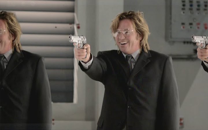
Here's how Val Kilmer actually appears in the movie:


Now THAT'S what I call false advertising!

C'mon, studio! There's no shame in the fact that your star's over 50 and bursting out of his jacket like Chris Farley. Happens to us all sooner or later. Would it have killed you to put an accurate representation of Val Kilmer on the cover of your DVD, rather than his high school yearbook photo? You may be afraid that putting the real Val on the cover might hurt sales, but this bait-and-switch tactic isn't going to help. It's just going to teach consumers to avoid your product in the future.

By the way, I don't know if this new floppy-haired look was the director's idea or if it was Val Kilmer's, but he's starting to look more than a little like Steven Cojo.

*Cuba, what happened, dude? You won a freakin' Oscar for Best Supporting Actor! So how'd you end up doing direct-to-DVD movies like this? Please explain.

Saturday, May 29, 2010

DVD Doppelgangers 10: Hard Ride To Hell vs. Darg Me To Hell

It's time for another edition of DVD Doppelgangers, in which I call out art directors who deliberately copy DVD covers and posters of popular movies, hoping to fool the public into buying their knock-off version.

Today we have a pair of "Dueling Hell" covers. On the left is the 2010 movie Hard Ride To Hell. Haven't seen it and know nothing about it, but boy does that cover seem familiar.

On the right is the cover for the excellent 2009 movie Drag Me To Hell. If you've not seen it, I highly recommend it. I wrote up a review of it last year here.

So let's see how many elements Hard Ride cribbed from Drag Me. Flames of Hell and smokey background? Check. Screaming victim? Check. Demonic hands clutching at victim? Big check! "To Hell" in both titles? Check. I will give the designer credit where it's due-- in a burst of creativity, on his cover he inverted the composition so that the demonic hands are pushing the victim into Hell instead of pulling them down.

Monday, April 19, 2010

DVD Doppelgangers: Another Woman

I decided to tweak the format of DVD Doppelgangers a little and place the examples side by side instead of several vertical inches apart, something I should have done from the start. See, even DVD cover mockers make mistakes sometimes.

Anyhow, today's entry is Another Woman's Husband (2000) vs Wild Things (1998).

I'm pretty sure Another Woman's Husband is a Lifetime Channel movie, which explains why I've never heard of it. Despite the copycat covers, the two movies have absolutely nothing in common. It's the gripping tale of a woman trying to overcome her fear of water after witnessing her brother drown, while Wild Things is the story of a teacher accused of raping his student.

Another Woman's Husband successfully copies pretty much every element of Wold things; you've got your two sultry sirens peering seductively out of the water, the actor credits strung across the top, even a male figure at bottom center. They even copied the colored banner placement at the top! The only difference between the two is the placement of the title and the font. Kudos to the designer! You copied 80% of an earlier, better layout!

One more thing: On the Wild Things cover, I can't help but notice that Mr. Matt Dillon appears to be auditioning to be the new scoliosis poster child.

Thanks to my pal KW Monster for pointing out these covers to me!

Thursday, April 15, 2010

Criminally Unfunny

I saw this DVD in Target today, and something about the cover image seemed familiar...


Oh yeah, now I remember where I've seen it before.

Back in 1978, Tim Allen Dick (or Tim Allen, as he's known to you and me) was arrested for possession of cocaine. He could have been sentenced to life in prison (!), but turned state's evidence and ended up serving 28 months in federal prison.

I can't help but wonder if filming this movie dredged up some unpleasant memories for him? If I was an ex-con I sure wouldn't want to put on an orange jumpsuit again just to film a dumb movie. Well, maybe if they backed a semi-truck full of money to my house.

This is another one of those Frankenstein covers. I'm willing to bet that not one of the seven people on the cover were photographed in the same room. Maybe not even on the same continent. The light is hitting every character from a totally different angle, the color tones are different for everyone, and Ray Liotta was even filmed outdoors, squinting under a noonday sun!

I'm assuming that all of the background figures are supposed to be staring at Mr. Allen, but they're all failing spectacularly. Not one of them is looking anywhere near his general direction. Shooting the actors separately like this and then combining them in Photoshop never, ever works, but that doesn't stop Hollywood art directors from doing it over and over and over.

Monday, February 15, 2010

DVD Doppelgangers: Sin City Vs The Spirit, Max Payne And The Cutoff

Hey kids, it's time for another installment of the feature that's sweeping the internet by storm: "DVD Doppelgangers!" The post in which I call out deceptive studios and lazy designers who mimic more successful DVD covers in hopes of getting you to buy theirs!

First up, we have Sin City. One of the better comic book adaptations to come down the pike in the past few years, and one that proves you don't have to deviate from the source material in order to make a successful movie.

Oh, Sin City, DVD cover designers just lovvvvvve you. What would they do without you? Whenever they need to design a cover for a dark and gritty movie about urban violence and decay, all they have to do is take your cover and plug in a new title and stars.

Take The Spirit for example (please!). Same angled, hand-lettered title, rendered all in blood red. Same black background. Same desaturated, gun toting cast members, standing at an angle (although in a burst of creative originality, here the cast is angled in the opposite direction. Bravo!). And there're those muddy splatters along the bottom again. I guess the designer misheard grindhouse as grimehouse, and thought the layout needed some mud.

Frank Miller wrote the Sin City comics, and here he adapts Will Eisner's excellent The Spirit comic. The Sin City comic was drawn in a minimalist black and white style, while The Spirit was rendered in a more standard style, and in color. Stylistically they couldn't be farther apart. So I find it odd that Miller filmed The Spirit as a virtual clone of Sin City - high contrast, black and white with occasional spot colors. It's almost as if he wants the public to think it's a sequel. But Hollywood wouldn't stoop that low now, would they?

Then we have the cover for Max Payne, based on the popular video game series. Again, it's a violent and gritty urban saga, so of course we have the obligatory black background, tilted red title (typeset this time, instead of hand-lettered), and desaturated hero. This one even throws in some rain or sleet or some kind of weather to further mimic the rain-soaked Sin City cover.

One other thing-- this cover contains a typo. Right there under the title where it says "Unrated?" That should read "Unwatchable." I'm just saying.'

Hey, not so fast, we're not done yet! Next we have Cut Off. I haven't seen this movie and know absolutely nothing about it. The cover's not quite as blatant as the others, but there's an undeniable Sin City-ness about it. Probably something to do with the angled text yet again (yellow this time) and the desaturated, almost black and white femme fatale. This designer actually did get a little bit creative here, as he substituted a horizontal rain of bullets for the vertical downpour of the Sin City cover.

The Cut Off cover's DNA becomes a little more clear if we take a look at one of the alternate Sin City covers (there were five different ones - collect 'em all!), and one of the theatrical posters.

At this rate, I predict that by 2015 (if video stores are still around) a full 85% of all DVD covers will be variations on Sin City's.

Wednesday, June 24, 2009

Battle-STARE Galactica

As I like to keep pointing out, I work as a graphic designer in a marketing department, so I have more than an average interest in advertising and packaging design.

That's why when I see something like this cover for the Battlestar Galactica Season 4 DVD Boxset, I am totally and utterly astonished:

How does something like this happen?

Whenever I design something, it doesn't end with me. It has to be approved by my boss, various department heads, and a compliance officer. At least six or seven different people have to sign off and approve my ad before it's sent off to the printer.

So what excuse does Universal Studios Home Entertainment possibly have for this piece of work?

I'm sure the designer meant for Lee Adama there on the left side of the cover to be staring meaningfully into the distance, pondering the fate of his race. But instead, he ended up taking a long, hard look at Starbuck's ample rack.

Universal is a professional corporate entity that no doubt has hundreds, maybe even thousands of employees. A hundred people probably looked at the proofs of this box cover and approved it before it was printed. It boggles my mind that not even one of those people noticed Lee's inappropriate gaze and said, "Maybe we should use a different photo of him. One that's not quite so... sexual harrassmenty."
Related Posts with Thumbnails
 
Site Meter