Showing posts with label money. Show all posts

Friday, May 3, 2013

Mo' Money, Mo' Problems Part Deux

Last week I blogged about our country's horribly designed new $100 bill and also voiced my belief that American money has always been the most bland, sterile and just plain downright ugly currency in the entire world.

But suddenly a new leader emerges from the pack!

This week Canada, our polite poutine-eating neighbors to the north, unveiled their brand new currency.

This is the front side of their new $5 bill, featuring character actor Wallace Shawn of The Princess Bride fame.

Oy gevalt. That is some seriously atrocious looking money there. I have no doubt that this was the result of many, many months of high level committee meetings by top Canadian government and treasury officials. So why then does it look like the Prime Minister let his 14 year old nephew design it?

Most currencies have traditionally featured intricately engraved artwork. There's a reason for that, besides making the portraits look good: engraved art is harder for crooks to counterfeit. These bills have none of that high end engraved look. They look for all the world like they were assembled from pieces of clip art. They look cheap, for lack of a better word.

These bills look exactly like vector art created in a public domain desktop publishing program. Look at the "5" and the word "Canada." They practically scream vector. Anyone with a computer, internet access and a modicum of skill could recreate one of these bills in an afternoon. That ain't good for security.

That swirling DNA helix design to the right is especially eye-searing. These new bills are printed on some kind of clear plastic polymer, so that white band is actually clear. You can look through it and see the various security doodads embedded within. So you want a window in your currency? Seems a little flashy, but who am I to judge? But if you absolutely insist on see-through money, couldn't you have just made a clear rectangle and called it a day? Why does it have to be framed by an unattractive explosion of maple leaves? 

Here's the back side of the new fiver. I didn't think it possible, but it's even worse than the front! What the hell is going on here? Is it commemorating that time the space robot went berserk and attacked the first Canadian astronaut? And again with the cheap vector fonts!

They didn't stop with the $5, they went all out and redesigned all their currency. Here's the new $10, which naturally features the image of classic author Charles Dickens. Somehow this one's not quite as offensive as the $5. If you removed the horrible clear strip on the right it might actually be passable. I said might.

God may save the Queen, but he's apparently powerless to keep her from appearing on badly designed currency.

Credit where credit's due: At the very least the new Canadian currency is certainly colorful, something our money here in the States has always sorely lacked.

That's noted humorist Will Rogers there on the Canadian $50, which is admittedly a bit odd as he was born in Oklahoma. I guess Canadians like their stories rambling and peppered with rope tricks.

Apparently they ran out of all the good colors by the time they got to the $100 and were forced to go with depressing, wrist-slitting brown and beige.

As you might imagine these new high tech bills incorporate all the usual modern security features, such as metallic inks, raised lettering, hidden numbers and even a clear see-through area in the polymer surface.

Best of all, each bill is scented for your enjoyment! There's a whole range of scents, color-coded to each denomination; blueberry for the $5, grape for the $10, key lime pie for the $20, cinnamon for the $50 and mocha for the $100. Now you can literally be stinkin' rich!

Friday, April 26, 2013

Mo' Money, Mo' Problems

Attention, Mr. and Mrs. America! Meet your brand spankin' new one hundred dollar bill! Not that the majority of us should concern ourselves; unless you're Mr. Drysdale or the leader of a drug cartel you'll likely never see one. But hey, at least we know they're out there!

The new bill is slated to premiere in October, 2013, a full three years after the original due date. Seriously? It took three freakin' years to come up with this thing? 

Cheezus, has there ever been a more obvious case of Design By Committee? I can practically hear the different factions now, sitting in the conference room and shouting out the items they thought essential:
"It's got to have a minimum of four "100s" on it or we simply can't approve it," said the Commission For Obtrusive Placement. 
"If you don't add a large foil inkwell with a ghostly quill hovering above it then we might as well all go home now," shouted the Council Of Unnecessary Technology. 
"Don't forget the thick, intrusive security strip," shrieked the Excessive Security Measures Panel. "And don't try to subtly weave it into the linen this time, make it as obvious and garish as you possibly can."
"And for god's sake print the portrait of Franklin in two different ink tones, and be sure to give him a pale, ghastly pallor!" screeched the Bureau Of Historical Desecration.
I get that with the advent of cheap color printing that counterfeiting is rampant, but do we really need all these anti-theft measures? The 3D security ribbon, the color shifting ink, watermarks, raised printing on Franklin's portrait... Jesus, just make it so it self-destructs if it gets within twenty feet of a copier and be done with it.

Credit where credits' s due though: the back of our new one hundred dollar bill isn't too awfully bad. It's dull of course, but at least it's clean and simple and I like the splash of color the large gold "100" at the right side provides. I just wish I could say the same for the front.

I've never understood why American money has always looked so bland, sterile and utilitarian. Hey government, it is possible to have nice looking money you know. Other countries do it all the time.

Take Austrailian money, for example. It's quite splendidly designed. Just look at that fiver! Gorgeous colors, clean crisp layout and just enough elements without looking too busy. And to top it off they used a portrait of 'er Majesty from her "Prime Of Miss Jean Brodie" phase.

China's RMB, or "the People's Currency" as they call it, is also quite attractive. This 100 rmb note is worth about $6 American dollars and is the one you'll see the most if you ever travel there. Best of all it comes in bright, festive red, just like Chaiman Mao's political views and his little book.

Filipino money is also quite handsome. So colorful. So balanced. So... self confident. Look at that money! It's almost oozing confidence. The slightly raised eyebrow, the subtle smirk of the lips. Why, it's practically smug!

Thai money is also quite nicely designed. They've even included white space, the hallmark of all good graphic design. 

Plus their bills have the added advantage of featuring Gary Burghoff as Thai Radar O'Reilly, silently judging you on the front. "Do you really need that new flatscreen TV?" Thai Radar asks accusingly as you reexamine your priorities. "No, I thought not," his piercing eyes seem to say as you put your wallet back in your pocket.


I just don't get why we can't have nice things like other countries.


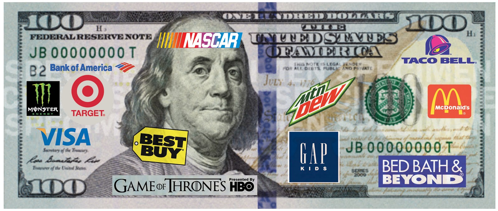
Of course given America's love of corporate sponsorship, I'm confident that something like this will be the next upgrade to our currency...
Related Posts with Thumbnails
 
Site Meter