Showing posts with label design. Show all posts

Friday, February 12, 2016

Don't Worry, Be... A Warrior

Take a good look at this DVD cover for the sure-to-be-classic film Princess Warrior.

I swear the first time I glanced at it I thought for sure it said Princess Worrier. No doubt that version would be far more entertaining than the actual movie.


Princess Worrier:
"You seek to betray me, wizard? Your powers are useless against my soul sword! Prepare to... wait, did I lock the house before I left today? Yes... yes, I'm sure I did. Prepare to die, Gornak! My soul sword will drain the life force from... oh gods, I forgot to send my annual fealty to the King. I need to dispatch a raven to the castle immediately. As I was saying, Gornak, your evil days are numbered! My sword will cleave... hmm. I wonder if this cough is anything serious? I've had if for a week now. I need to visit the apothecary as soon as I'm done here. My luck it's probably the plague. Have at you, Gornak! Um... Gornak? Hello? Where'd he go?

Thursday, March 5, 2015

If You See Something, Say Something!

This week popular bourgeois pizza restaurant Domino's launched brand new social program.

Domino's Leadership announce they design glorious new logo to honor Motherland. Unfortunately, certain capitalist dog franchise owners have not replaced old outdated logo. This is serious violation, as all Domino's must conform! Citizens urged to seek out franchises with old logo and report violation to Domino's Central Command.

Cossacks who refuse to update to new logo will be sent to gulag, while citizens who report them will receive free gift card, and chance to win free pizza for year.

Remember Comrades! It is your duty to report your non-conforming, running dog neighbors for the glory of the Motherland!

Friday, April 26, 2013

Mo' Money, Mo' Problems

Attention, Mr. and Mrs. America! Meet your brand spankin' new one hundred dollar bill! Not that the majority of us should concern ourselves; unless you're Mr. Drysdale or the leader of a drug cartel you'll likely never see one. But hey, at least we know they're out there!

The new bill is slated to premiere in October, 2013, a full three years after the original due date. Seriously? It took three freakin' years to come up with this thing? 

Cheezus, has there ever been a more obvious case of Design By Committee? I can practically hear the different factions now, sitting in the conference room and shouting out the items they thought essential:
"It's got to have a minimum of four "100s" on it or we simply can't approve it," said the Commission For Obtrusive Placement. 
"If you don't add a large foil inkwell with a ghostly quill hovering above it then we might as well all go home now," shouted the Council Of Unnecessary Technology. 
"Don't forget the thick, intrusive security strip," shrieked the Excessive Security Measures Panel. "And don't try to subtly weave it into the linen this time, make it as obvious and garish as you possibly can."
"And for god's sake print the portrait of Franklin in two different ink tones, and be sure to give him a pale, ghastly pallor!" screeched the Bureau Of Historical Desecration.
I get that with the advent of cheap color printing that counterfeiting is rampant, but do we really need all these anti-theft measures? The 3D security ribbon, the color shifting ink, watermarks, raised printing on Franklin's portrait... Jesus, just make it so it self-destructs if it gets within twenty feet of a copier and be done with it.

Credit where credits' s due though: the back of our new one hundred dollar bill isn't too awfully bad. It's dull of course, but at least it's clean and simple and I like the splash of color the large gold "100" at the right side provides. I just wish I could say the same for the front.

I've never understood why American money has always looked so bland, sterile and utilitarian. Hey government, it is possible to have nice looking money you know. Other countries do it all the time.

Take Austrailian money, for example. It's quite splendidly designed. Just look at that fiver! Gorgeous colors, clean crisp layout and just enough elements without looking too busy. And to top it off they used a portrait of 'er Majesty from her "Prime Of Miss Jean Brodie" phase.

China's RMB, or "the People's Currency" as they call it, is also quite attractive. This 100 rmb note is worth about $6 American dollars and is the one you'll see the most if you ever travel there. Best of all it comes in bright, festive red, just like Chaiman Mao's political views and his little book.

Filipino money is also quite handsome. So colorful. So balanced. So... self confident. Look at that money! It's almost oozing confidence. The slightly raised eyebrow, the subtle smirk of the lips. Why, it's practically smug!

Thai money is also quite nicely designed. They've even included white space, the hallmark of all good graphic design. 

Plus their bills have the added advantage of featuring Gary Burghoff as Thai Radar O'Reilly, silently judging you on the front. "Do you really need that new flatscreen TV?" Thai Radar asks accusingly as you reexamine your priorities. "No, I thought not," his piercing eyes seem to say as you put your wallet back in your pocket.


I just don't get why we can't have nice things like other countries.


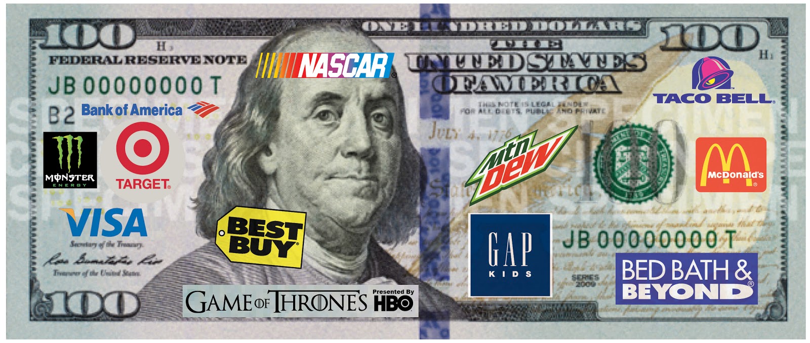
Of course given America's love of corporate sponsorship, I'm confident that something like this will be the next upgrade to our currency...

Tuesday, August 7, 2012

More Famous Business Cards

As you no doubt know, one of my many fascinating hobbies is collecting old business cards. Here are just a few from the collection:

Here we have a typical no-frills (also known as "cheap") business card from the 1960s. As you can see, the phone number is missing; presumably Mooney's secretary forgot to add it when ordering the cards. I can only imagine how frustrating it must have been to have such a scatterbrained and inefficient personal assistant.

It appears that Mooney was too frugal to have the cards reprinted and either he or the secretary simply scribbled the phone number in by hand. Classy.

A rare vertical business card; very unusual for its time. The overly ornate nature of the design is unusual as well, evoking an earlier period of time.

Strangely enough even though it looks like the card is a hundred years old, it's actually roughly the same age as the others shown here. This "Munster," whoever he was, must have been a real beast and was extremely hard on his cards.


Another typical card from the late 1950s - early 1960s. Cards of this era were generally bland and conforming, not wanting to rock the boat or stand out from the crowd.

I can only imagine how many times the poor sap who owned this card had to explain to people, possibly even his own family, exactly what it was he did for a living.

Saturday, July 18, 2009

Off Target

I'm usually a big fan of Target's in-store branding and marketing. All the signage and decorations in their store are very well designed as well as fun and appealing. I especially like their gift card designs.

But, you can't hit one out of the park every time at bat.

Take a look at this bottle of Target brand mouthwash I bought recently. It features their new "On-Target" rounded arrow motif. Frankly I'm not a fan of the arrow; I thought the old circular "target" logo was fine. Maybe in time this new logo will grow on me.

But what really caught my eye one morning as I stood over the sink trying to focus on the bottle of mouthwash was this:I even did a double take the first time I glanced at it. Call me crazy, but that refreshing splash of amber-colored mouthwash looks disturbingly like a dead cockroach lying on its back.

Now every time I look at it that's all I see; I can't not see a dead cockroach. Not really the image you want in your mind's eye when you're using mouthwash.

It's OK, Target. I still love you. You're one hundred times better than Walmart. But lose the roach, huh?
Related Posts with Thumbnails
 
Site Meter