Step 1: I started out by drawing Richie and friend on paper in pencil, then inked them with a brush pen. If you've never used one, brush pens are great; they're like markers with flexible brush-shaped tips. You get the same result as you would with a real brush, but without the mess. Plus they're much easier to use than a real brush, which is good, because I'm not a very good inker.
I drew this a year or more ago and at that time I didn't have a graphic tablet. If I was doing this today I would skip the drawing on paper and inking steps and draw it right on the screen with the graphic tablet. It cuts out a couple of steps, plus with the tablet I have the advantage of the precious undo button.
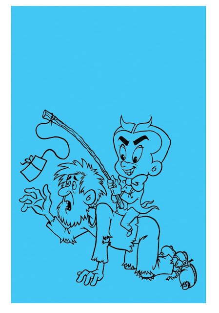 Step 2: Once the drawing was done, I scanned it and placed it into Photoshop, where I touched up any mistakes (believe me, there were plenty). I then added the background color, which was just a solid rectangle of blue. If you add the background color first, then it's easier to pick colors that will make the foreground characters pop.
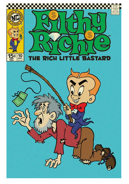
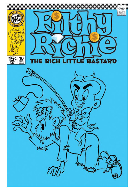 Step 3: I added the Richie logo, the Comics Code seal, the corner box and the checkerboard at the top. All those elements were created in Illustrator, then imported into Photoshop.
This layout is an amalgam of my favorite old school comic cover elements. Back in the late 1960s & early 1970s, DC Comics had a checkerboard stripe across the top of all their books. This served two purposes; it helped identify the comic as a DC book on the newstand or comic rack, and it looked "mod." Marvel comics always had a box in the upper left corner that contained a little image of the star character, again to help you spot your favorite book as you fanned through a stack. And lastly, Harvey Comics always had the large title character logo, with a small descriptive blurb underneath, as in "Casper, the Friendly Ghost."
The little Richie figure in the upper left box was drawn in pencil & ink too, just like the main drawing.
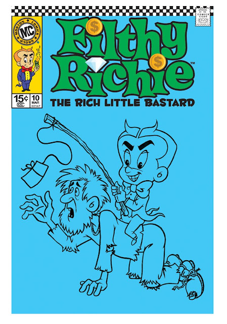 Step 4: I added color to the logos and such at the top of the cover. A pretty simple step; I just added the colors onto a layer beneath the logo and graphic elements.
 Step 5: The next step was to add color to the Richie and Bum figures. The color was added to a layer beneath the line drawing (that way you can change the color of the figure without affecting the outlines).
Because the figures were scanned from a real drawing, that layer was opaque. I had to multiply this layer so that the white would disappear and show the colors underneath (I hope all that made sense). Now that I've started drawing directly on screen, I don't have have to multiply the drawing layer anymore.
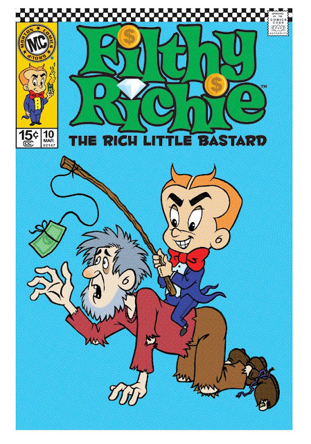 Step 6: Once I got all the colors the way I wanted them, the next step was to add halftone effects to make it look like an actual printed comic cover. I duplicated all the layers of the drawing, then merged them into one layer, and moved this layer to the top of the stack.
I then went to Filters/Pixelate/Halftones in order to add the halftone effect. You just have to play with the settings to get the scale of the halftones right. Too small and they won't show up, too big and it obscures your purty drawing.
The halftone layer will most likely look really harsh or blurry. To fix this, multiply this layer, then adjust the opacity. Again, you'll just have to eyeball it until it looks right. I think I ended up making the opacity of my halftone layer 30%. The halftone layer will now combine with the other layers and should look like a reasonable facsimile of an offset printed piece. Not entirely accurate, but pretty darn close (note that the halftone dots are virtually invisible in the image above. Click and view the larger image to see them).
You could stop with this step if you want your fake comic cover to look mint. I wanted mine to look like a 30 year old comic that someone found in a box in their basement, so I added some aging effects.
 Step 7: To age the cover I first made a new layer (make sure it's the top layer) and added a solid yellow fill. Then I multiplied this layer and adjusted the opacity so the art beneath would show through, but would now have the tell-tale yellowish tint of old newsprint.
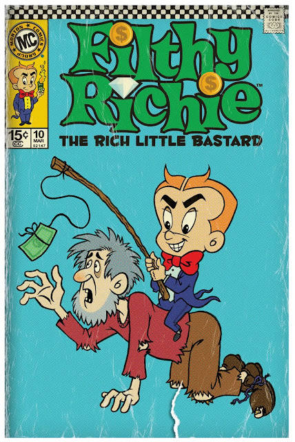 Step 8: Lastly I added various scratches, tears, folds and dirt on various layers. There's no good way to explain it; I just used a scratchy brush and started scribbling until it looked like real scratches and tears. I also used a large brush to darken the edges of the cover. It's pretty easy to go overboard and end up with a cover that's too dirty and aged, so that's why I use a lot of layers. That way if I see I've gone too far, I can just delete the offending layer without disturbing the rest of the aging.
See? It's just that simple! 8 little steps with several dozen smaller steps in between.


No comments:
Post a Comment
Note: Only a member of this blog may post a comment.