Showing posts with label how to draw. Show all posts

Friday, July 5, 2013

How To Draw Hair Highlights in Photoshop

Gather round kids, it's time for another art lesson! Today we're gonna learn how to draw highlights in a character's hair.

Take a good look at Rockabilly Vampire's impressive gravity-defying coif here. Notice how it glistens and shines in the light, as if it's been coated with hair gel or "product" as the hairdressers like to call it?

Hair highlights are something I've struggled with for years. Not on my own head, mind you, but on the heads of characters I draw. I've never been able to figure out a good way to draw them that satisfied me and didn't take hours and hours to render. 

Until now. I think I've finally come up with a good way to simulate gleaming hair highlights. There are probably other better ways to do this, but this is the one I came up with. 

Note: These steps are for Photoshop, but would probably work in any bitmap drawing program that features layers.

First you've got to start with a drawing. Kind of makes sense, right? Your line drawing should be on its own layer, preferably at the top.

Make a new layer underneath the line drawing layer and add color, shading and whatever else you've got planned.

Here's where the highlight part comes in. Make a new layer above your color layer. Pick a color that's a bit lighter than the hair and draw a thick stripe across the front of the hair (where the light source is coming from).

I used a scratchy brush with fuzzy edges to draw the highlight. I dialed the flow of the brush down to around 20% to draw the middle of the stripe, then lowered it to 1% or 2% to blend in the edges (the edge blending is important). 

Try to follow the contour of the hair to help define the shape and give it some dimension.


Next pick a color that's a big lighter and color the center of the stripe. The two tones help make the highlight look more realistic.

Once that's done, make a copy of this highlight layer. Why a copy? Because you're gonna start erasing it and if you're anything like me you're gonna mess it up and need to start over, so having a copy of it will save time and prevent lots of cursing and mouse-throwing.

OK, once you've made a copy of this highlight layer, turn off the original. Now take your eraser tool and start erasing vertical stripes in the highlight. Use a sharp brush for the eraser and leave it at 100% strength. I like to make four or five thick stripes all across the highlight to serve as guides for the additional erased lines that'll be coming later.

Again, try to make the erased lines follow the contour of the hair. Don't just erase perfectly straight lines.


Once that's done, keep going and erase the rest of your lines in the highlight stripe. Vary the lines; thin next to thick looks best. Remember, you're supposed to be simulating strands of hair here.They also don't all have to go all the way through the highlight, some can stop halfway through.

If you're satisfied with the way the stripes look, good for you! Most likely you'll want to try it again, and that's where your foresight and planning pays off-- you made a copy of the highlight, remember? So now you can copy it again and give it another go.


Once you're happy with the stripes, pick a fuzzy brush for the eraser, dial it down to 1% and erase the edges a bit more to make them blend in better. 

That's it! You've just created cool glistening highlights in your character's hair! Now go brag about it on Facebook and Instagram it or whatever the hell people are doing these days.

Thursday, December 8, 2011

Space Dweebs Little Moldin' Book Step By Step

Now that my 2011 Xmas Card/Book is finally finished I thought I'd post a step by step look at how I work, for the two or three people out there who may be interested. 

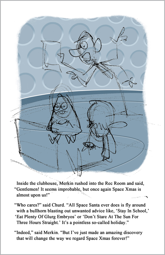
I usually start out each page with a rough sketch. And I do mean rough. Look at that thing! It would be tough to prove I'm an artist if that's all I had to go by.

I drew the sketch in ink and then scanned it into Photoshop. I used Photoshop for the entire book, by the way.

Last year I drew very elaborate sketches and had everything planned out to the letter. This year I just sort of winged it. I did very few sketches on paper, doing most of them right on the screen in Photoshop. Most of them were stick figure chicken scratches that were sketches in the academic sense only.

Once the sketch was in place I added the text. This year's book is much wordier than last year's. I think because I had a more detailed story to tell.

The text changed practically on a daily basis too, as I condensed and reworded sentences for clarity.

Next it was time to start on the background. It might seem odd to draw the background first, but it helps me by giving me an environment into which to place my characters.

The wall and floor were each on a separate layer. I use a lot of layers when I work in Photoshop. It's a little extra work setting things up that way, but it pays off when you decide you want to change something. It's much easier to make changes when an object is isolated on its own layer.

Next I added a piece of molding between the wall and floor.

Next I added a curvy line to the floor. Why curvy? Because a curvy line is alien and futuristic.

The curvy line and molding were on separate layers, natch. 

I struggled for a while trying to come up with something to put on the wall of the Rec Room. At first I was going to add the standard futuristic flashing light panels but that seemed too cliched. Then I thought about viewports showing the vastness of the universe outside, but was afraid that would be too busy.

At the last minute I decided to steal, er, create an homage to the classic TARDIS interior from Doctor Who. I added several rows of round recessed panels (called "roundels") to a layer and then distorted them so they'd be in the proper perspective.

I thought the background needed a bit of color so I made a new layer and added yellow to the roundels.

There's lots more steps to see after the jump!

Friday, November 4, 2011

How To Draw A Cyberman In 42 Easy Steps

A couple of days ago I finally completed my Evolution Of The Cybermen vector drawing poster. As always when I do a vector drawing, I use InDesign.

I don't think most people believe me when I say that I use InDesign, as it's made for page layout and making books rather than drawing. Illustrator is usually the program of choice for vector drawing. I really don't like Illustrator though. I've tried and tried to use it and make myself like it, but... I just can't stand it. InDesign has most (not all) of the same drawing tools and they work much better and more intuitively for me than Illustrator's do. So I draw in InDesign.

In a way drawing in vector is a lot like building a model kit. You construct your drawing out of parts and pieces and each piece has to be assembled in a certain order. Unlike a model kit though, I don't ruin my drawing by accidentally spilling glue all over it and throwing it across the room.

Anyhow, I thought readers might be interested in seeing how I go about drawing my vector characters.

Whenever I draw any kind of cartoon character, I usually start with the head. The head's the part that gets the most attention so I figure that's as good a reason as any to begin there.

Step 1: I drew the general shape of the Cyberman's head and colored it a bluish gray. Most of the Cybermen are silver, which is tough to simulate onscreen. Obviously gray would be the best color to represent silver, but a page full of plain old grays would get old fast. I usually add a little bit of blue to the gray to give it a slight bit of color and visual interest.

Step 2: Then I drew the Cyberman's "mask" or whatever you want to call it. I made it a lighter gray.

Step 3: Next I drew a couple of tapered curved lines to indicate the sides of the Cyberman's head. Note that the lines are a bit longer than the head and stick out past the boundaries. That's OK for now, as we'll see in the next step.

Step 4: I used InDesign's "Place Into" feature to, well, place the lines into the head. Now they don't hang over the edge and they're behind the mask where they ought to be.

Step 5: Next I added a darker square behind the bottom of the mask, to give the head a little more dimension. I also added the neck. The neck was pretty much the same color as the mask, so I added a darker shadow to it to help separate it from the head.

Step 6: The mask needed to look a bit more three dimensional, so I added edges to it. I decided the light should be coming from the left (MY left!), so the left hand edge is light, while the right hand edge is dark. These edge shapes were basically just different colored clones of the mask, placed behind it and offset a bit.

I just noticed the head looks a lot like Magneto's mask.

Step 7: Next I added the wide ridge on top of the head. It was drawn the same way as the mask, with light and dark edges to give it some dimension.

Step 8: I added a highlight to the middle of the mask. It seemed to need something there to keep it from looking flat. To draw the highlight I just made a white shape and used InDesign's "Feather" effect to give it a soft, blurry edge.

OK, now we're starting to get somewhere. Have you ever watched a new home being built? It seems like the construction workers fiddle around with the foundation for weeks and weeks without ever making any progress. Then suddenly the next day, BAM! The walls and roof appear in an hour.

Vector drawings are like that. You work on the foundation for what seems like forever, but then once that's done, the drawing starts taking shape very quickly.

Step 9: Next I added the eyes. For the eye I drew a dark circle, then added a small "tear drop" shape to the side. I used InDesign's "Add" feature to combine these two separate shapes into one. Then I added dark and light edges to the inside of the eye by placing curved shapes inside.

Once I had the left eye done, I cloned it and flopped it to make the other eye. That's one of the fun parts about working in vector. When you're drawing something symmetrical, you only have to draw it once.

Step 10: Next I drew the mouth. When this version of the Cybermen speak, their mouths light up with bluish white lights that flash in rhythm with their speech. To make the mouth lights I drew a light blue bar and then a thinner white bar on top of it. I feathered them both, then cloned them until I had three of them. I then placed all three bars inside a horizontal black strip and placed it on the face.

See, what did I tell you? It took a while for it to look like anything, but suddenly it's definitely a Cyberman head!

Step 11: I drew a light gray band around the outside of the head. I also added a "top knot" to the top of this band.

Step 12: Next I drew a second slightly larger and darker band around the first one.

Step 13: Then I drew the beginnings of the Cyberman's "ears." Basically just boxes with rounded corners.

Oh, we're not nearly done! Read the rest by clicking below.

Wednesday, December 15, 2010

SantaTaur Little Moldin' Book: Behind The Scenes

Now that my 2010 SantaTaur Christmas Card/Book is finally finished, I thought I'd post a behind the scenes look at how I made it, for the two or three people out there who may be interested.

As you'll recall, last year I drew and posted a SantaTaur book cover and posted it here on my blog. I decided to expand the cover into a full blown book for this year's Christmas card. I was able to reuse last year's cover (seen on the left) for this year's book (on the right). Unfortunately the old cover had totally different proportions, and it took a surprising amount of reconfiguring to make it work for the new book. I hated the simplistic town on the original cover, so it went through a lot of modifications.

I was able to reuse the endpapers and back cover from last year's Gronkorr book with no changes.

On the left is the original sketch for the title page. As you can see it went through a lot of changes by the time I got to the finished product. I wasn’t happy with last year’s SantaTaur logo, so I redrew it (in vector in InDesign) for the book. Sharp eyed readers will note that the two logos are virtually identical, but I cleaned up some lines and angles and things that were bothering me about the original.

This was the first page I worked on, and it taught me a lot about how to draw the rest of the pages. The final version is fairly close to the sketch.

I did a couple of sketches of the elves, but I didn't have time to think about their color scheme until I started on this page, so I just sort of came up with it on the fly. I thought elves that dressed in red & green were too much of a cliche, so mine are dressed in blue. They're Jewish elves, don't you know.

Note that in the sketch the calendar read December 20th, but after I thought about it that seemed a bit late in the month for Santa to start conducting all his experiments and building his equipment, so I changed it to the 1st. Yeah, I really put that much obsessive thought into this thing.

I knew this was going to be a tough page, what with all the elves working down on the factory floor. I drew two armless elves (facing different directions), then used Photoshop to clone them over and over until I had an assembly line. Then I drew arms on each one, handling various toys. It’s hard to see, but each elf really is working on a different toy; dolls, robots, balls, rockets, etc. I had to keep making the elves and factory floor lighter and lighter so that it looked like they were off in the distance.

There's also a whole landscape there outside the windows.

Here's a peek at a "lost page" from the book. I really, really wanted to include a page where Santa gazes at his reindeer and suddenly gets the idea to combine himself with them, much to their dismay. He turns into a half-reindeer centaur after all, so it seems like there should be at least one reindeer somewhere in the book. I wanted him to shout the idea out loud and have one of the reindeer overhear him and have a horrified look on its face.

Unfortunately there just wasn’t room to include this page. Because of the way books are made, to add this one page I’d also have had to add three more, and that just wasn’t practical. Plus, if I had him disclose his plan here, then he'd be saying pretty much the same thing on two pages and it would kind of ruin the big reveal on page five. So I had to settle for the line about the “reindeer grinding and sifting process.”

I think this may be my favorite page in the book. I tried very hard to make the elves look like they were “acting” on each page. I wanted each one to be doing a "bit" rather than just standing around.
I wanted Mrs. Claus to look like a severe and humorless old harridan. She went through a couple of versions before I was satisfied with her. I’d like to redo her boots though. It’s supposed to look like her boots have large “cuffs” at the top, but it looks more like she’s wearing black capri pants under her dress. There just wasn't time to correct everything.

I spent a lot of time on that door, too. As you can see from the sketch, I wanted it to look like light was streaming through from inside the lab, to imply that Santa was inside conducting dangerous experiments. I tried drawing the streaming light a hundred different ways, but I just couldn’t get it to work. I’ve learned by now that that’s the signal that you should just drop an idea. The reindeer motif at the top was a last minute addition.

Of course when Santa writes a note, he writes it in a Christmas-y Old English script font.

I had fun with this page. The chalkboard drawing went through a lot of revisions (it wasn't even a chalkboard in the sketch!). At first it was a Santa shape + a reindeer shape = a SantaTaur shape, but I couldn’t get that to fit no matter what I did. I decided that revealing SantaTaur here lessened his impact when he finally appeared, so I deleted him and added the two DNA strands.

If you look closely, you can see that Santa is holding a blueprint of the Magic Gift Bazooka. There’s also a drawing of the Transmorphicatation Chamber on the wall above him as well.

I like the elf in the foreground that doesn’t understand what the hell Santa’s going on about.

This page went through a lot of revisions. Many times something that works in a sketch just doesn't work when you draw it for real. I kept adjusting the size of the Transmorphicatation Chamber and the elves until I found a happy balance. All the characters were on multiple layers inside separate folders, so it was easy to alter their sizes. Good ol' Photoshop! What would I do without you? Remember that, gang: Photoshop layers and folders are your friends!

I drew all four elves and then hated them, so I scrapped them and drew them all over again.

The elf throwing the switch gave me a lot of trouble. The elf with the clipboard kept obscuring the Switch Elf. But if I took out Clipboard Elf then there was an unsightly blank space in the corner. I finally hit on the idea of putting the Switch Elf up on a box so he'd be visible.

The Transmorphicatation Chamber is an homage to the teleport pods in the Jeff Goldblum version of The Fly. I didn't want an exact copy, but something reminiscent. The elves' white protective suits are a shout-out to the ones worn in Willy Wonka and the Chocolate Factory, still one of my all time favorite movies.

Once everything was laid out, the page seemed kind of meh. It just didn't have any energy. I stared at it for a long time and then tilted the Chamber like it was an out of balance washing machine, to give the impression it was churning and working. That did the trick (well, for me anyway). The swirls of energy and atoms were a last minute addition.

This was a very troublesome page, but it turned out to be my second favorite. In the original sketch, SantaTaur stood there in the center of the page, arms akimbo, as the elves looked on in astonishment. The trouble was, SantaTaur was standing directly in front of the Chamber, making it nearly impossible to see it. It wasn't clear that he'd just emerged from it and looked like he'd suddenly just appeared in the center of the room.

I tried moving the Chamber over to one side, but that just made it look like I didn't know how to lay out a page. So I scrapped the whole page and did some more sketches.

Finally I got the idea that instead of showing him already out of the Chamber, I'd show him in the act of emerging from it. That was the answer! I like the smoke and steam pouring out of the doorway of the Chamber, as if dangerous fumes were involved.

As you can see from the sketch, this page went through a lot of changes too.

At first I drew the building on the left and then flopped it for the building on the right. It looked a little too obvious, so I scrapped the right-side building and drew a new two story one. I drew one Christmas tree and was able to clone it and reuse it to make a small forest. I cloned and reused one elf, but the rest of the crowd are tiny individual drawings. Even though she's in pretty much the same pose as she was on page three, that's an all new Mrs. Claus, not a copy.

Originally SantaTaur was taking off and flying to the left, but when I put the book together I saw that there would be two very similar "flying to the left" pages placed side by side. To help change things up a bit I flopped this page so that he was flying off to the right. I then had to reverse the "Naughty" & "Nice" text on the bazooka to read right.

I knew this page would be a major headache, and I was right. The sketch seemed a little claustrophobic to me, what with the houses packed so closely together. I wanted to open up the page to show a vast environment. But that meant I'd be drawing hundreds of buildings. Oy.

I did everything I could to keep from having to draw a couple hundred individual houses. I even tried modeling a 3D neighborhood in Google SketchUp. That didn't turn out so well-- trying to combine precisely rendered 3D houses with a painterly background and character just didn't work.

So, I gritted my teeth, sat down and started drawing houses. I was able to take advantage of technology somewhat to make my life a little easier-- because it was center point perspective, I drew the houses on the left side of the page, then flopped them to fill in the right side. I then added random cars and shrubs to the neighborhood.

At first I had four images of SantaTaur flying over the houses and firing his Gift Bazooka, but that was a little confusing. I was afraid it would look like there were four SantaTaurs instead of one. Plus it made the layout way too crowded. So I deleted the extra Santas and just kept the Bazooka zaps. Hopefully it still reads that you're seeing a kind of time-lapse image of the path he's taken through the sky as he fires gifts at various houses.

The green zaps mean the resident of that house was Nice and got a good gift; and of course a red zap means they were Naughty and received coal.

You'll notice that SantaTaur's sporting a wreath tattoo on each arm. Did he have those before he transformed, or did the Chamber add them? I'll let the viewer decide.

Once I got everything laid out it seemed like something was missing. Then it hit me-- it's Christmas! Houses have Christmas decorations! So I added Christmas lights to most of the houses (and if you look closely, a few lit trees visible in some windows).

This page started out predominantly blue, but the color scheme looked way too much like the previous page, so at the last minute I altered the color to a bluish green to help it look a little different. That's one of the greatest things about drawing on the computer. If I'd have actually painted this page and decided to change the color scheme I'd have had no choice but to start over. On the computer, changing the color is as simple as moving a few slider controls. How did we ever get any work done before computers?

This page also went through a lot of changes. In the sketch the kids are in their bedroom when the gifts come crashing through the ceiling, but later I thought it would make more sense to show the living room instead. That's where your presents are placed, right? The living room started out yellowish orange, but I changed it to green to give the book some variety.

Note that in the sketch, the boy got a sack of coal. Did he get one in the finished version as well? I'll leave that to the reader's imagination.

Once I had it all drawn, the room seemed a little bare, so I added the torn Christmas decorations near the ceiling.

This was another problem page, and the one I saved for the very last. It went through a lot of revisions, mostly onscreen. As you can see from the sketch, it was originally going to be pretty much the same as page nine. I decided that was a bad idea, and changed the perspective a bit.

In my mind I pictured homes in the foreground and a city in the distance, to give the impression that SantaTaur's reign of destruction was worldwide. That was harder to draw than I thought it would be. Luckily if you add enough trees and obscuring flames you can get away with a lot!

Have you ever seen a photo of a jet breaking the sound barrier? When it does, a white disk made of superheated air or something forms around the plane. I drew such a sonic boom disk around the tiny SantaTaur in the sky to imply that he was breaking the sound barrier as he sped off, but it just looked dumb (plus I was afraid readers wouldn't understand what it was supposed to be), so I dropped it.

The sky on this page was also dark blue, which made three dark blue sky pages in a row (well, almost in a row). Boring! So I changed the overall color scheme of this page to red, which made a lot more sense since the world is burning.

I changed a lot of color schemes on various pages once I assembled the book and saw all the pages together. You don't realize that you've got too many pages of one color until you seem them all side by side.

This page came out pretty much like the sketch; there weren't any major changes other than flopping the image. It was a little tough drawing SantaTaur's foreshortened finger though, and that went through a few versions before it looked right.

The "Merry Christmas Everyone" text was hand drawn in InDesign.

Friday, April 9, 2010

Oily Boid Step-By-Step Guide

Several people (OK, one) have asked how I did the Oily Boid vector drawing, so I thought I'd make step-by-step how to guide. You'll probably have to click on the image and enlarge it to see the details.

Step 1:
Here are the various shapes and parts I drew to make the bird and worm. I used the mouse this time, not the graphic tablet, to draw the parts in InDesign. Note that I didn't actually draw all the parts strewn about the page this way; this exploded view is just to illustrate the pieces that make up the character.

Step 2:
I drew various shapes and colored them until I had a reasonable facsimile of a cartoon bird and worm. Note that the colors are all flat at this point, with no shading.

The biggest challenge in doing vector as opposed to bitmap drawing (for me, anyway) is the planning involved. When I do a bitmap drawing, I jump all around the character. I start with the eyes or nose, move on to the head, then the body, back to the mouth, etc.

With vector it all has to be planned out. You make the head, then the eyeball, then the iris, then the pupil, then the highlight. You can't jump around or you'll end up with a piece underneath another. It's like putting together a model kit or a puzzle.

Step 3:
To add shading, I drew darker colored shapes over the various parts of the characters. At the top of the frame is the shape I drew to shade the bird's head. Again, I didn't really draw the shading up at the top of the page like that, I drew it directly on top of the bird's head. I set it up there in order to be seen better.

Once I got the shape and coloring right, I feathered the shape in InDesign to give it a softer edge. You can feather shapes a little or a lot; there's no set formula. I just eyeball it until I think it looks right. Once the shape was feathered, I cut it and then placed it inside the bird's head.

Step 4:
I continued to add shading to the rest of the bird and worm. I also added a shadow under the bird.

Step 5:
Once the shading was done, I added details to the characters. Things like feathers on the bird's body, spots on his beak, lines on his legs, etc. I also added segment lines and white highlights to the worm.

Step 6:
Next I used InDesign's pencil tool to draw an irregularly shaped background. I played around with the color until I thought it looked right.

Step 7:
Then I placed a grungy bitmap texture into the drawing.

Step 8:
I then placed the bitmap inside the green background shape, and used InDesign's blend settings to combine the two. Again, there's no real formula for doing this; I just play with the settings until I see something I like.

Step 9:
I thought the background was a little dark, so I added a white shape to the center and feathered it so it would have a soft edge.

Saturday, January 9, 2010

How To Get Cool Colored Lines In Your Photoshop Illustrations

Take a look at the two images above. Astute observer that you are, you'll notice that the illustration on the left is drawn with pure black lines, while the one on the right has more subtle colored lines. Both images are fine, but usually I prefer to use colored lines whenever possible. It gives the illustration a kind of animated feature feel, and just seems more polished.

But Bob, you're pleading? How can I get cool colored lines in my illustrations too? Get up off the floor and stop begging and I'll show you.

Thursday, May 21, 2009

Dr. Manhattan: From Sketch To Final Art

Here's a step by step guide to how I did my Dr. Manhattan drawing, if anyone's interested.

Step 1: Doc started out as a rough sketch that I scanned and placed into Photoshop.
Step 2: I used the sketch as a guide to draw the body on a new layer with the pen tool. Usually the characters I draw have an outline (like the sketch) but I went a different direction this time.
Step 3: Next I added details to his head and lower body (again with the pen tool instead of the usual brush) on a separate layer. Adding details to a separate layer makes it easier for me to make changes.

(Not shown: The part where I try to decide if I should go ahead and draw his wiener or not)
Step 4: I added each arm on a separate layer as well. This made the shading that's coming up in the next step easier to do. Note that his right arm is on a layer underneath his body.

Step 5: Then I added shading on yet another separate layer. Again, that makes it much easier to edit if I don't like the way it looks.

To do the shading I selected his body, then created a new layer. I then had a blank layer with a selection in the shape of his body. I used the brush to add the darker blue shading. Because I was painting inside a selection that was the exact shape as his body, the shading didn't slop over into the background (I hope all that makes sense). I repeated the process for each arm.
Step 6: Finally I added a shadow under his floating feet, an energy ball around his hand, and a scratchy painted background, all on additional layers. Layers are your friends, kids!

Sunday, May 17, 2009

Cosplayer: From Sketch To Final Art

Here's a drawing from beginning to finished piece, if anyone's interested.

Step 1: It started out as a rough doodle in my sketchbook, which I scanned into Photoshop.


Step 2: I adjusted the opacity of the sketch to around 20%. Then I created a new layer and drew the figure (on the graphic tablet) over the sketch. I then deleted the sketch layer.

Sometimes I keep the sketch layer for fun and just turn it off so that it's invisible.


Step 3: I adjusted the color of the lines, because I've found that adding color to them looks more interesting than having plain black outlines.

I also added the lightsaber blade. Note: If you want something to look glowly, make it white in the center and add color to the edges.


Step 4: I added color to the figure on a separate layer beneath the drawing. For this drawing I went with pale, washed-out colors instead of my usual eye-searing bright palette.

Not shown-- the part where I hide under the desk because the drawing's not turning out right and I tell myself I can't draw and I'm a fraud and everyone's going to find out.


Step 5: Then I added color to the background on a layer beneath the drawing and its color. Remember, kids, layers are your friend!


Step 6: Added aging effects, just because.
Related Posts with Thumbnails
 
Site Meter