Showing posts with label count gothula. Show all posts

Wednesday, January 22, 2014

Dr. Killdeath & Count Gothula's Venomous Christmas Step By Step

Now that my 2013 Xmas Card Slash Book is finally finished I thought I'd post a step by step look at how I work for the two or three people out there who may be interested.

I picked a page featuring both the main characters, so you can see how I drew the two of them.

It all starts with a sketch of course. Sometimes I sketch with pen and paper, sometimes I sketch right on the screen in Photoshop. This is a pen and paper sketch. I scanned the pen and paper sketch, then dropped it onto a page in Photoshop. I then typed in the text below.


The entire book was created in Photoshop, by the way (with the exception of the cover logo, which was done in InDesign).

The original sketch of the characters looked a bit wonky (artist's term meaning not very good) so I did a second, digital sketch. This one came out a lot better, as the characters are much more on-model. The sketch is on its own layer, so I can change its transparency and turn it off when it's no longer needed. 

I use a lot of layers on these drawings. A lot. Like 75 or more for a page like this. Layers are your friend. When you use a lot of layers, it makes it easier to change elements when you inevitably decide to do so.


Next I added a background color, complete with a sloppily-painted gradation in the center. Don't worry, I made it sloppy on purpose, to mimic the feel of a painted kid's book.

I then started blocking out Dr. Killdeath's shapes, starting with his head. I added shading and other appropriate details as well.

In actual practice I would lower the transparency of the sketch layer and then use it as a guide to draw the colors underneath it. I thought that would be too confusing here though, so I deleted it. If you want, just pretend you can still see the Dr. Killdeath sketch.


I then blocked out the Doctor's body and legs. All these elements are on different layers, of course.

Next I added the Doctor's glass dome and the rivets that fasten it to his skull. The dome is on a layer underneath his head.

I drew his brain next, on its own layer.

As I mentioned in the Behind The Scenes post, I seem to have a lot of trouble drawing brains and getting all the fiddly little folds to look just right. So once I drew the Doctor's brain once, I copied and pasted it on every page. Yep, Dr. Killdeath's brain is the exact same piece of art throughout the entire card slash book.
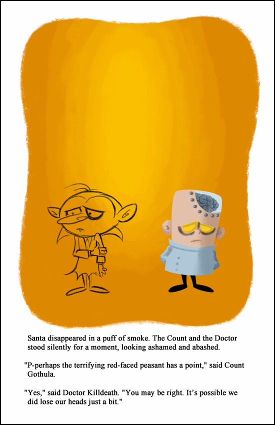

Next I added the fiddly little brain folds I just spoke of.

And then I added the bubbles, to help sell the idea that his brain is floating in some sort of nutrient tank. The bubbles were on their own layer of course, and I dialed down their opacity so they'd be semi-transparent.

Next I added the inside of his head, behind the brain. It's a subtle thing, but it makes him look a bit more three dimensional instead of a flat cartoon.

Then I added some defining lines to his head and body. I let the shapes beneath the lines define their color. For example, the Doctor's lab coat is a light blue, so the coat's lines are a darker blue. 


Colored lines give the piece more visual interest than plain black ones would.

The next thing I added was a white glare to his glass dome. It's kind of hard to see here, so you may have to zoom in.

Then I added some red on his forehead, nose and cheeks. The red's on its own layer, so I could adjust the transparency. It's amazing to me how just a little touch of red can add a ton of life to a character.

Lastly I added a white outline around the Doctor. I started doing that a few years ago with the Santataur Is Comin' To Town card slash book. It helps make the character pop a bit and separate them from the background.

The outline is on its own layer, and I think I dialed down the opacity to 85%.

By the way, here are all the layers it takes to make Dr. Killdeath. 14 in all. Actually that's a pretty low count for me. Some of my characters are made of two or three times that many layers.

Still, 14 is a lot, and it can get confusing when you're searching through the menu for a particular layer. That's why I arrange all my layers inside folders. It takes a little extra time to set up, but it's worth it in the long run.

Plus you place all the layers inside a folder, it acts like a single layer. You can move the folder, scale it or change its opacity and all the contents will react accordingly.

So that's it for Dr. Killdeath! On to Count Gothula.

I started on the Count by blocking out his head (on a separate layer).

By the way, I had electronic model sheets of both characters that I could refer to, to help me draw them the same way on every page. I used the eyedropper tool in Photoshop to sample their various skin and clothing colors to make sure those were consistent as well.

Next I drew the Count's body and legs.

And then I added his red collar on another layer. I used the pen tool to draw the collar. It was a lot quicker than trying to paint the curves with a brush. With 28 pages to draw I had to save time wherever I could.

Next I added his right arm.

And then-- you guessed it-- his left arm.

Once again, by putting all these parts on their own layer, it's a lot easier to make changes. For example, if the Count's entire body was on the same layer and I decided I wanted to redraw his right arm and hand, I'd end up erasing most of his body in the process.

But because his arm is separate, changes made to it don't affect the parts underneath.

Then I added the colored defining lines to him. Count Gothula always gets two stray hairs on top of his head.

Next I added the Count's facial spots. I'm not exactly sure what these are supposed to be or why they're there. Maybe they're some kind of vampire liver spots? Whatever they are, he didn't look complete without 'em.

The spots were in a specific pattern that's the same on each page. Three in the lower left corner of his face, one in the upper left corner, and then two in the upper right.


I know what you're thinking right now: "Bob's got Aspergers!"


Then the Count get a bit of red on the end of his nose. It's on a layer with the opacity dialed down, just like the Doctor's.

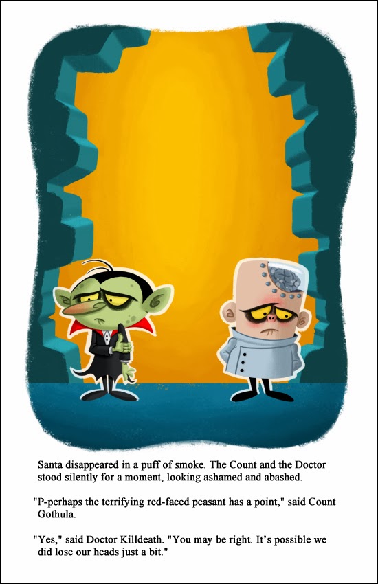
And lastly I added the outline around the Count.

OK, so much for the characters. Now let's tackle the background.

Now that the characters were done, it was time to start on the background. I added a new layer and drew a floor.

Next I added another layer and painted in the shattered walls on both sides of the page.

I then locked that layer so that the brush would only affect the walls. Then I started shading the walls to give them some depth.

I wanted it to look like light was streaming in from outside, so I added wall shadows to the floor.

Next I painted in some rubble on the floor, to sell the idea that one of the Doctor's "gifts" had knocked a hole in the castle wall.

And then I added the shadows cast by the rubble.

And I added the shadows cast by the Count and the Doctor. All of these shadows are on separate layers of course, so I could play with the opacity of them.

We're in the home stretch now!

Next I added the dissipating image of Santa. The idea here is that Santa, who figured prominently on the page before this, has now teleported back to the North Pole, and what we're seeing here is his ghostly afterimage.

The Santa Cloud was drawn on its own later with a rough, scratchy brush. I made the Cloud orange to suggest fire and brimstone.
Next I played around with the Santa Cloud, using Photoshop to warp and skew it like it's made of wispy smoke. I also adjusted the opacity to make it look like it's slowly fading away to nothing.

Lastly I added yellowing and aging effects to the page, as if it were from a thirty or forty year old book. Needless to say, these aging effects were on their own layers. You have to restrain yourself when you're adding aging to something, as it's very easy to go overboard. In fact I may have gone too far here.

I have a confession to make: these aging effects-- the yellowish tint and the dark smudges-- are the exact same ones I first created for 2009 Christmas Card. I've been reusing them ever since. Hey, they work, so why waste time recreating them? Why not recycle them?

And voila! Only 32 simple steps from start to finish. Actually there were many more steps to drawing the page than I've shown here; these are just the major ones! Then I repeated the process 27 more times and before I knew it I had a book!


Monday, December 16, 2013

Christmas Card 2013: Dr. Killdeath & Count Gothula's Veomous Christmas

At long, long, long last, my 2013 Christmas card slash book is finished! This is the reason I haven't posted any artwork on my blog since sometime in August-- I've been working on this thing like crazy!

Like every year, it was touch and go there for a while and I honestly wasn't sure it would be done in time for Christmas. Christmas 2013, that is. Every page took way longer to draw than I expected, my annual computer problems cropped up, and even the weather threatened to shut down the project.  

The Good News: It's finally finished, with a few days to spare before the Holiday! The Bad News: This is the last of these cards I'll be doing. I know I say that every year, but this time I mean it. So enjoy the last ever Christmas card slash book!


As I do every year, right after I finished the 2012 card slash book I started thinking about what I was going to do for 2013. 

I'd drawn both Dr. Killdeath and Count Gothula way back in 2009 and even made a fake Little Golden Book cover starring the Doctor back then. I'd always wanted to do something with the characters and decided this was the proper venue for them.

I quickly came up with an idea where the two would battle it out with deadly Christmas gifts. For the past three years these cards slash books have been sixteen pages. This year was going to be a whopping twenty eight! Almost twice as long! I knew the extra page count would take longer to draw, so I started working on it much earlier than I usually start these things, in late August.

Thank Thor I did. Despite the fact that I started so early, it came right down to the wire again. Although this book only has two main characters, each page was incredibly complicated and took a long time to draw. Then I had my annual spate of computer problems, as my graphic tablet started unexpectedly losing its pressure sensitivity. If you've never used a graphic tablet before, trust me, that's a bad thing. 

Even the weather conspired against the project! In early December we got a huge ice storm. The last time that happened the ice downed power lines all over the city and my electricity was out for a whopping five days! Five! I sat nervously at my computer during the storm, fully expecting the power to go out any second. Fortunately that didn't happen, but it was a harrowing night.

I finally finished the thing on December 14! If I'd have started it in October or November like I usually do, I'd still be working on it at Valentine's Day!

Because of the amount of pages I had to draw, I took advantage of Photoshop and reused elements whenever possible. For some reason I have a lot of trouble drawing brains. All those fiddly little folds are really tough for me to get right. So once I drew Dr. Killdeath's brain once, I reused it on every page in which he appears. Yep, every time you see his brain, it's the same piece of art.

The same goes for the Doctor's little robotic minion. I drew him once, then started to draw him again on the next page and thought, "Why am I reinventing the wheel here?" He was basically a ball and appeared pretty much the same from any angle, so I reused him on every page as well.

Is this cheating? I like to think of it as working smarter, not harder.

Like last year, I didn't draw the pages in order. This was intentional, as it's normal for you to get better at drawing your characters as time goes by. I didn't want the later pages to look better than the early ones, so by jumping around they all have a uniform mediocrity (heh).

Drawing the pages out of order meant I had to keep track of all kinds of little details. I drew the page where Count Gothula opens the gift containing the Man Eating Tornado before he received it, so I had to remember that the gift box should be red with gold ribbon in both.

Working out of order came back to haunt me at least once though. The first time I drew the Count's castle was in a closeup on the page in which he receives the first gift. Much, much later I drew the establishing shot of the castle, and then found that it didn't match the closeup at all. So... I had to go back and redraw the closeup. Whoops!

In all we see eight deadly Christmas gifts. There were originally a lot more, but even with the expanded page count I couldn't include them all. I did manage to at least mention the rest of  them on the Soul Sucker page though.

In past years I've always written out the story first before illustrating it, so I'd know how much space I'd have for the drawing. This year I wrote out the story last, after everything had been drawn. A dangerous way to work, I know. Some pages had way too much text and I had to shrink the artwork a bit just to get it all in.

Hopefully there aren't too many typos in the text. A few always creep in, no matter how many times I proofread it.

As I said before, this will unfortunately be the last of these card slash books that I do. I enjoy working on them, but they're a lot of work. A lot. I worked on this thing virtually every day for four months! Four! And not just a few minutes a day for four months, I'm talking hours, every day, for 120 days. That's a big chunk out of my year. It's just too much work for too little reward. 

I'll probably still do some kind of Christmas thing next year, but it'll be something simpler that doesn't take up a fourth of my year. 

You can check out my earlier card slash books here:
Related Posts with Thumbnails
 
Site Meter