Showing posts with label spider-man: far from home. Show all posts

Tuesday, July 9, 2019

What Happened To The Art Of Movie Poster Design: Spider-Man: Far From Home Again!

Man, the hits, er, I mean the horribly designed movie posters just keep comin.' I don't know what the hell's going on, but so far Summer 2019 has a been an absolute goldmine of god-awful lobby art.

Nowhere is that more evident than with Marvel/Sony's upcoming Spider-Man: Far From Home. Apparently Sony must have had a "Bring Your Kid To Work Day," and one of their designers let their son or daughter take a crack at the entire Spider-Man ad campaign. 

Sony definitely went all out for this film. They didn't just stop at one bad design, they gave us a whole slate of 'em! And yes, I'm blaming Sony here, because Marvel Studios usually puts out decent posters.

Given that the movie's finally premiered, this will likely be the last horrible Spider-Man: Far From Home poster that'll ever be featured. Enjoy!
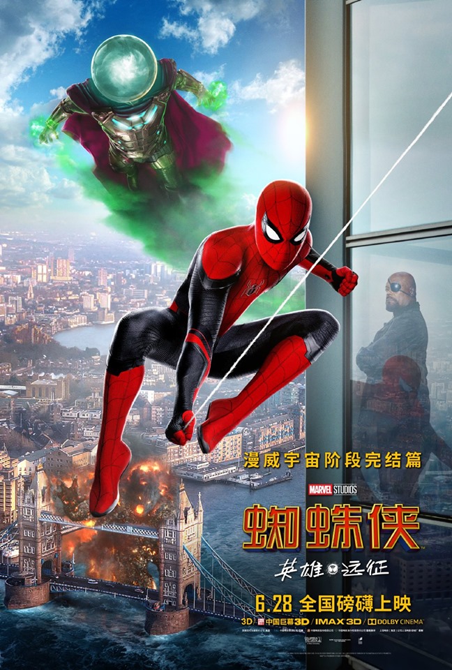
Here we have the Chinese version of the poster. Not sure whether it was made here in the States or by someone in the Orient, but either way, it's an awful, awful design.

The actual figures themselves aren't too awfully bad for once, and it appears that someone actually too the time to create a customized cityscape, rather than slapping down some uninspired clip art.

The problem here's with the composition. The title's wayyyyyyyy too small down there in the corner. Were they afraid of covering up London Bridge? The release date and other verbiage should all be drastically reduced in order to free up space for the title.

And why is there an acre of space at the top, just to the right of Mysterio? You could almost stick another poster in that real estate!

Lastly, what the holy hell is up with Nick Fury in this poster? As with every other Spider-Man: Far From Home poster, Sony desperately wanted to remind us that Samuel L. Jackson stars in the film. But there was a problem here. Nick Fury doesn't swing from webs or fly. So how do you include him in a layout that features characters cavorting a thousand feet off the ground?

The answer's simple! Create a non-existent 300 story building containing fifteen foot tall ceilings, and have him posing in front of a window just as Spidey & Misty swoop by! Never mind that the windows are somehow both translucent and reflective (which I suppose is possible, but unlikely), nobody'll ever think twice about it.

Congrats to Sony for another winning design!

Monday, June 24, 2019

What Happened To The Art Of Movie Poster Design: Spider-Man: Far From Home

Man, the hits, er, I mean the horribly designed movie posters just keep comin.' I don't know what the hell's going on, but so far Summer 2019 has a been an absolute goldmine of god-awful lobby art.

Nowhere is that more evident than with Marvel/Sony's upcoming Spider-Man: Far From Home. Apparently Sony must have had a "Bring Your Kid To Work Day," and one of their designers let their son or daughter take a crack at the Spider-Man ad campaign. 

Sony definitely went all out for this film. They didn't just stop at one bad design, they gave us a whole slate of 'em! And yes, I'm blaming Sony here, because Marvel Studios usually puts out decent posters.

First up we have this cobbled-together monstrosity. I kind of see what they were going for here, as the designer attempted to place the main characters over the spider symbol seen on Peter Parker's costume. Unfortunately it doesn't quite work, as the figures cover up way too much of the symbol and make it virtually unrecognizable. It ends up looking like they're posing in front of gigantic tuning forks. I'm sure it probably looked a lot better in the mind's eye of the designer.

The overly retouched faces are another added bonus. Tom Holland's currently twenty three, but looks about sixteen. I doubt there's a single wrinkle on his entire face, so why'd they feel the need for such extreme airbrushing? He looks like a plastic mannequin here.

And then there's the lighting, which illuminates the characters from three completely different directions. Nothing says "None Of These Actors Were In The Same Room When Their Photos Were Taken" like separate light sources! Professional!

Lastly, there's the clip art landmarks. Yes, I understand this is the purpose of clip art. But most artists try to customize it a bit, rather than just downloading an image and plopping it unchanged into their design.

Apparently the designer was so pleased with the way the first poster turned out that they decided to use it as a base for this second version. This time they place the figures inside a could of neon tube triangles for some reason. 

They reuse the three main figures here, although these versions aren't touched up as severely as the others, and end up looking much more natural. Apparently the designer had some dead space at the bottom, and decided to fill it haphazardly with a couple new characters. Note that once again, they're lit by completely different light sources. Hey, at least their incompetence is consistent.

And once again there's more clip art awkwardly inserted, to clumsily let us know the movie takes place in London.

And then there's this design. Jesus wept. I don't even know where to begin. It's... attention-grabbing, I'll say that for it. Of course one could have said the same thing about the Hindenburg explosion too, so...

I think maybe they were going for some kind of retro illustration vibe here, but sadly they failed miserably. Oddly enough the landmark line art isn't a terrible concept, but it's very poorly executed, as there's no apparent thought to how the elements are laid out.

As you might expect by now, once again we have three characters with three light sources. And apparently there's exactly ONE photo of Samuel L. Jackson as Nick Fury in the entire world, as they've used it on THREE different posters now. And how about that image of Jake Gylllllennnhaaaalll as Mysterio? Check out his thrilling action pose there, as he stands stock still, facing the camera as if he's at the DMV. Exciting!

You've heard the expression "Let's Throw Some Ideas At The Wall And See What Sticks?" This is the visual representation of that saying.

Credit where it's due— I don't actually mind this poster. It's a clever idea, playing on the old idea of travel stickers slapped on a suitcase, and the extreme closeup means there's not a lot they can screw up. I won't go so far as to say "well done," but I will say "reasonably adequate job."
Related Posts with Thumbnails
 
Site Meter