Showing posts with label what happened to the art of movie poster design. Show all posts

Saturday, February 4, 2023

What Happened To The Art Of Movie Poster Design: Paradise City And 80 For Brady

There was a time when theater lobbies across the land were filled with exciting movie posters featuring top notch illustrations. Sadly, that time is long past. These days the cineplex walls are littered with poorly Photoshopped one sheets that wouldn't be accepted in an introductory design class.

Case in point: this poster for the recent John Travolta & Bruce Willis vehicle Paradise City.

Holy cow! That's some quality Photoshop work there! I love how the "designer" brazenly took two separate images of the stars taken under wildly different lightning conditions, then merged 'em together and expected us to believe they were standing together. Seamless!

Plus I will bet my house and its entire contents that that ain't Travolta's body underneath his giant bobblehead.

Ah, but somehow it gets even worse! Check out Travolta's gun-totin' right hand, which has clearly been Photoshopped in. How do I know that? Because if you look very closely, you can actually see the original hand underneath it, buttoning his blazer! They didn't even paint it out before replacing it!

Sadly, Paradise City's being billed as Bruce Willis' final movie, as his health has forced him to retire from acting. How unfortunate he had to go out on a regrettable note like this.

Next up is this poster for 80 For Brady, a new comedy about four lifelong friends and fans of football player Tom Brady, who travel to Texas to watch him play in Superbowl LI in 2017.

For years now I've lamented the fact that we never get illustrated posters like the ones painted by the incomparable Drew Struzan. 

Welp, looks like my prayers have finally been answered. By the time they got done touching up the gals in this poster, it's ceased to be a photograph and became 95% pure, unadulterated painting!

OK, there's no shame in growing old (I've been doing it myself lately), but Jesus Christ! NONE of these women have looked anything like this in decades. Especially Jane Fonda! She's currently 85, but looks like she's barely into her forties here. Same goes for Rita Moreno, who's 92, but looks a youthful 60 here. Their faces have been airbrushed and smoothed nearly into oblivion, to the point where they're practically unrecognizable. The only one who looks halfway natural is Sally Field, who's the kid of the group at 76.

And once again, NONE of these four women were anywhere near one another when their photos were taken. And I'll eat a bag of bees if anyone can prove that's actually Lily Tomlin's body under her massive noggin!

Monday, August 24, 2020

What Happened To The Art Of Movie Poster Design: Tenet

There was a time when theater lobbies across the land were filled with exciting movie posters featuring top notch illustrations like these. Sadly, that time is long past. These days the cineplex walls are littered with poorly Photoshopped one sheets that wouldn't be accepted in an introductory design class.

It's been a while since we've played "What Happened To The Art Of Movie Poster Design" here at Bob Canada's BlogWorld. Most likely because it's been a good six months since there've been any new movies and corresponding posters released. You know, what with the whole end of the world thing and all. 

There've been a few posters that've trickled out in the past week or two though, and brother, were they well worth the wait! Let's get to 'em, shall we?

Yes, it's film auteur Christopher Nolan's latest sci-fi opus, Tenet. As near as I can tell from the trailers, it's about a man with the power to reverse the movie projector so it looks like everything's happening backwards. Groundbreaking!

Warner Bros. is going all in on this film, as they just released not one, not two, but TWELVE different freakin' posters!

Obviously Warner must have fired all the designers in their Marketing Department at the beginning of the lockdown, and were forced to hand the assignment over to an unpaid intern.

Faced with a task for which they were never trained, this resourceful intern just took a bunch of screencaps from the trailer, pasted the movie's title over them at an oblique angle, uploaded them and then went back to diddling with their phone. Heck, they may have actually used their phone to cobble them together!

The entire process probably took fifteen minutes, tops.

Seriously, these are NOT movie posters. I'm not even sure what you'd call them. Thumbnails? Photoshop "sketches?" Placeholders to be used until the real art is finished?

Go back and look at those real posters at the top of the page. Note how they draw you in, and cause an emotional reaction. When you see the Jaws poster, you fear for the swimmer's life, as you know she's a goner. Likewise, The Thing poster features some unseen horror that explodes right at you, invoking fear and unease.

Compare them to these Tenet "posters." The only reaction I'm getting from them is one of boredom and apathy. They don't tell me a thing about the movie, and I'm too busy stifling a yawn to care.

A movie poster is supposed to pique the audience's curiosity— to the point where they HAVE to see the movie to find out what the images are all about.

Are any of these so-called posters compelling you to see the movie? Or are they just making you scratch your head in confusion for a few minutes before you go back to arguing with anti-maskers on Facebook?

Thursday, June 18, 2020

What Happened To The Art Of Movie Poster Design: The Hitman's Wife's Bodyguard

First of all, forgive the awkward title of this post. It's supposed to be "What Happened To The Art Of Movie Poster Design: The Hitman's Wife's Bodyguard." Apparently the wonderful Blogger interface puts a limit on title length, so the last two words got cut off. There doesn't appear to be anything I can do about it.

It's been a while since we've played "What Happened To The Art Of Movie Poster Design" here at Bob Canada's BlogWorld. There's a good reason for that
— thanks to the current world-ending pandemic (which isn't over yet!), there ain't been any new movies or accompanying posters released for a good four months.

This week we finally got a glimpse of a new one though, and boy is it a doozie!

There was a time when movie posters featured top-notch illustration and graphic design, created by the finest artists in the field. Sadly, those days are gone forever, replaced by a squad of lowly interns and first year art students armed with a pirated copy of Photoshop.

Today's posters are generally little more than photo collages or screen grabs with the film's logo hastily slapped at the bottom.

Which leads us to today's subject— The Hitman's Wife's Bodyguard.

First things first though, before we get to the so-called design. This film is a sequel to the , tepid 2017 action/comedy The Hitman's Bodyguard, starring Ryan Reynolds and Samuel L. Jackson. 

I was surprised to see the film was getting a sequel. Surely no one out there was clamoring for a follow-up to this anemic outing? Welp, maybe they were. A quick trip over to BoxOfficMojo reveals that the original film grossed an astonishing $176 million worldwide, against its minuscule $30 million budget. That's a decent return in any accountant's book, making a sequel inevitable. 

OK, on with the poster for the new film. Holy crap! Look at that butt-ugly thing! Obviously all the actual designers are on lockdown and unable to work from home for some reason, so the studio handed the job over to their unpaid intern.

Where do I even begin? How about with the oddly washed out and desaturated colors? THAT'LL catch the eye of moviegoers in the lobby! 

And then there's the strange "triple vision" effect, which looks like the intern was playing around with various Photoshop filters to see what each one did.

The highlight of the poster though has to be Selma Hayek's arms. I get that they were trying to do a foreshortening effect, to make it look like she's pointing her guns at the viewer. It didn't work. It looks like if she put her freakishly short arms down at her sides, her hands would be just about even with her waist! Eww...

Good job centering her huge rack in the middle of the poster though, so the viewer's eye is drawn right toward them. I'm assuming a guy designed this thing.

Also, note how the names at the top don't line up with the figures below them. You know what that means! Somebody had a dispute about top billing! Whenever that happens, the studio mixes up the names so it's impossible to tell just who's listed first.

One last thing about this gawd-awful poster before I go— we're apparently at the point now where we can say "batshit" on a movie poster that'll be seen in theater lobbies across the country. We're very near the end of civilization.

Sunday, April 12, 2020

What Happened To The Art Of Movie, Er, TV Poster Design: The Walking Dead: World Beyond

It's been a while since we've played "What Happened To The Art Of Movie Poster Design" here at Bob Canada's BlogWorld. Time to remedy that situation right now!

There was a time when movie— and TV— posters featured top-notch illustration and graphic design, created by the finest artists in the field. Sadly, those days are gone forever, replaced by a squad of lowly interns and first year art students armed with a pirated copy of Photoshop. 

Today's posters are generally little more than photo collages or screen grabs with the film's logo hastily slapped at the bottom.

Which leads us to today's subject. Never ones to know when the horse is dead and they should stop beating it, AMC is producing yet another spinoff of their once successful series The Walking Dead.

This particular series, titled World Beyond, concerns a group of sheltered teens "who leave the safety of their home and embark on a cross-country journey through the zombie-filled landscape to save their father." 

Oh boy! Teens battling zombies in a post apocalyptic world. Remind me when it's on so I can scrub the grout in my shower instead!

Anyway, here's the poster for World Beyond, and what a piece of art it is. 

So... what's with the garish, eye-searing day-glo colors? Is this supposed to be a comedy? A wacky road-trip series? A straight up parody of the zombie genre? It's gotta be one of those, because this poster does NOT say, "Grim, nihilistic drama" to me. In fact it looks more like a poster for a 1990s cartoon series, or a commercial for Japanese noodles.

Look, posters are all about establishing tone. A poster should give the viewer an idea of what the show's like, so they can decide whether they're interested or not. In that regard it's an utter failure.

All this poster tells me is that the creators of this show don't have any idea what it's about. That or the producer let his teen nephew design the poster, and he decided to make it look "Kewl."

It honestly reminds me a bit of the poster for the execrable Suicide Squad movie from a few years back. Which was another perfect example of a poster with a tone completely inappropriate for its subject matter.

Friday, January 31, 2020

What Happened To The Art Of Movie Poster Design: The New Mutants

It's been a few months since we've played "What Happened To The Art Of Movie Poster Design" here at Bob Canada's BlogWorld. Time to remedy that situation right now!

There was a time when movie posters featured top-notch illustration and graphic design, created by the finest artists in the field. Sadly, those days are gone forever, replaced by a squad of lowly interns and first year art students armed with a pirated copy of Photoshop. 

Today's posters are generally little more than photo collages or screen grabs with the film's logo hastily slapped at the bottom.

And then there's this beauty. It's the poster for Marvel/Fox's upcoming The New Mutants movie, which is a spinoff of the X-Men franchise. 

Jesus Christ! This... this can't be real, can it? Please tell me this is a piece of particularly egregious fan art, and not something pumped out by a major movie studio. Someone at Fox— excuse me, 20th Century Studios— actually got paid to "design" this monstrosity!

So it appears they opened five separate pics of the actors in Photoshop, turned off the blue channel and applied a crude, baby sh*t yellow outline to them all. They then took a scratchy brush and used their foot to write out the "logo," which reveals slivers of skulls from medical books beneath the letters. Brilliant!

I've honestly seen more attractive "Employees Must Wash Hands" signs in restaurant bathrooms.

The New Mutants was actually filmed back in 2017, but was notoriously delayed several times. No doubt they were holding it back for three years until this magnificent poster "design" was ready to present to a waiting public!

Monday, September 23, 2019

What Happened To The Art Of Movie Poster Design: Frozen 2— An Actual Good Design!

For the past couple of months I've been obsessively complaining about the sorry state of current movie poster design. 99% of it is pure, undiluted crap that would embarrass a first year art student. When I look at the artwork lining the walls of my local cineplex, I'm baffled as to how any of it was ever approved, much less printed and sent out for use.

Today I thought I'd try something different for a change, and present a movie posters that's actually GOOD. Bear with me— I'm a little rusty, as I'm not used to praising poster art.

Here we have the Japanese poster for Disney's lonnnnnng-awaited Frozen 2. My god, it's full of stars! 

Seriously, that is one fine-looking poster. I love everything about it, from the monochromatic color scheme to the faux cut-paper design, which gives it a 3D look. It's a goddamned masterpiece in every measurable sense. I never saw the original Frozen and have no particular feelings toward it one way or the other, but I would happily hang this poster on my wall.

Why does Japan always get all the cool stuff? They get better movie posters, better versions of DVDs and blu rays, and their cities even build giant life-sized Gundam statues! It ain't fair!

For the record, this is the one we're getting here in the States. It's not terrible, but the colors are inexplicably muted and the design's static. A movie poster's supposed to entice the viewer, not lull 'em to sleep! Meh.

Saturday, August 31, 2019

What Happened To The Art Of Movie Poster Design: The Girl On The Third Floor

For the past couple of months I've been obsessively complaining about the sorry state of current movie poster design. 99% of it is pure, undiluted crap that would embarrass a first year art student. When I look at the artwork lining the walls of my local cineplex, I'm baffled as to how any of it was ever approved, much less printed and sent out for use.

Case in point: This alleged "poster" for the new indie horror film Girl On The Third Floor. 

Wow. That's... that's really something there. I'm honestly not sure what exactly I'm looking at. I think I can kind of make out a vague hint of a humanoid figure, which I assume is supposed to be the girl of the title. But I'm not quite sure, as the artist apparently used black mold as his medium of choice.

Nice choice of font and color as well. Who cares if it's unreadable! Flaunt those stodgy old graphic design rules!

If this poster was done by one of those people who has to paint with their foot or hold the brush in their mouth, then I take it all back and say "Good job!". If not, then whoever did this needs to forget about art and get back to their part time job at Arby's.

Hopefully the cineplexes across the company will use THIS alternate poster, and wrap their fish in that first one. Now THIS is a poster! I love everything about it— the striking, especially the attention-getting background color and the wonderful illustration of the house that morphs into a heart. It's amazing.

Best of all is the fact that it's very reminiscent of a 1970s or 1980s paperback book cover. I could easily see this used on the front of a Stephen King novel. Well done, whoever did this!

What Happened To The Art Of Movie Posters: How Lazy Can You Get?

Here's the new poster for Warner Bros./DC's upcoming new Joker movie. For some reason the entire internet has a huge bone for this film, as there's a ton of buzz about it. I don't get it myself, but it wouldn't be the first time I didn't understand popular opinion. 

Anyway, here's the new poster for the movie, and it's part of a brand new trend that's popped up in the past month or two. I call it the "Movie Still Movie Poster."

Look at that thing! The designer literally just took a frame cap from the movie, typed the title over it, added a distressed filter to it, then called it a day and went home before lunch.

This is the ultimate in pure, unadulterated laziness. A poster like this takes neither talent or skill— anyone with a copy of Photoshop could throw it together in less than ten minutes. Heck, forget Photoshop, you could probably whip up something like this in Microsoft Paint!

Fox (aka Disney) did the same thing a couple months ago with their poster for mismatched buddy comedy Stuber. Again, literally just a screen cap, with a title hastily typed over the top of it. This one probably took even less time than the Joker one.

Same deal with Midsommar. Good movie, incredibly lackadaisical screen shot poster.

Rocketman (which sadly wasn't about the early days of NASA, but rather a biopic of Elton John) had a Movie Still Movie Poster as well.

Remember when movie posters were actual pieces of art? Works that were drawn and painted, by talented artists and illustrators? Jesus, what the hell happened? Help us Drew Struzan! You're are only hope!

Saturday, August 24, 2019

What Happened To The Art Of Movie Poster Design: Star Wars: The Rise Of Skywalker

Welp, this happened today...

Disney just released the poster for their upcoming film The Rise Of Skywalker, the "final" entry in the Star Wars franchise. Everyone who believes this is really the last one, stand on their head...

So... a lot to unpack here. When I first saw the image pop up on Facebook, I honest to god thought it was a fan poster. It's not terrible per se, but it definitely doesn't look like the work of the biggest movie studio in the world. It looks exactly like something a talented but amateur artist would post over on DeviantArt. 

I'm also getting some definite Frozen vibes from it. If they replaced Rey and Kylo with Elsa and The Other One, it would look right at home hanging above the bed of every ten year old girl in the country. In fact if I didn't know better I'd swear this was a poster for an animated feature rather than a live action movie.

In a surprise plot twist, it appears that Rey and Kylo Ren will engage in a lightsaber battle. WOW! Who could have predicted a story arc as fresh and innovative as that?

And look who's overseeing the big lightsaber battle— a cartoon version of our old friend Emperor Palpatine, last seen way back in The Return Of The Jedi. So what the hell's he doing on this poster? Well if you'll recall, The Force Awakens set up the mysterious Supreme Leader Snoke as the Big Bad of this new trilogy.

But then in the execrable The Last Jedi, talented young auteur Rian Johnson, who needs to learn how to spell his name, thought it would be funny to subvert our expectations and kill off Snoke in the middle of the goddamned movie... and not replace him with anyone else.

So short of just pretending The Last Jedi never happened, the filmmakers had little choice but to drag Palpatine out of mothballs and install him as the new villain. Jesus wept.

Lastly, for a movie called The Rise Of Skywalker, there seems to be a definite lack of Luke on the poster. Of course that may have something to do with the fact that he died in the previous film. But hey, if the Emperor can come back, so can he! Could it be a red herring, and Rey will turn out to be the titular Skywalker? Who knows? And at this point, who the hell cares?

Monday, August 12, 2019

What Happened To The Art Of Movie Poster Design— Bad Film, Cool Posters

For the past couple of months I've been obsessively complaining about the sorry state of current movie poster design. 99% of it is pure, undiluted crap that would embarrass a first year art student. When I look at the artwork lining the walls of my local cineplex, I'm baffled as to how any of it was ever approved, much less printed and sent out for use.

Today I thought I'd try something different for a change, and present a series of movie posters that are actually GOOD. Bear with me—  I'm a little rusty, as I'm not used to praising poster art.

Here we have the poster for Warner Bros. latest opus The Kitchen. By all accounts the movie's a massive flop, but damn if that isn't a good looking poster.

By the way, this movie's about a trio of women whose husbands all go to prison, so they attempt to keep their criminal rackets going by themselves. Um... didn't we already see this movie last year, when it was called Widows?

Anyway, normally I'm not a fan of photographic posters, as I think they're lazy and uninspired. I like what they've done with this one though, especially the closely cropped faces and duotone tinting.

They released a series of character posters for the movie as well, which are all just as nice.

I'm loving the color-coded grid arrangement behind the large figures, which makes for a striking layout.

I especially like this one, as all the elements just come together perfectly here. These posters have a very strong graphic design feel to them, which is probably why I'm so drawn to the series.

By the way, the movie's supposedly based on a DC/Vertigo comic of the same name, which I've never heard of or ever seen in a shop. I looked it up and apparently it's true though. Great job by the casting director! I wonder which one of these characters Melissa McCarthy's playing?

Wednesday, July 17, 2019

What Happened To The Art Of Movie Poster Design: Dark Phoenix— An Actual Good Design!

For the past couple of months I've been obsessively complaining about the sorry state of current movie poster design. 99% of it is pure, undiluted crap that would embarrass a first year art student. When I look at the artwork lining the walls of my local cineplex, I'm baffled as to how any of it was ever approved, much less printed and sent out for use.

Today I thought I'd try something different for a change, and present a movie posters that's actually GOOD. Bear with me—  I'm a little rusty, as I'm not used to praising poster art.

Here we have the poster for Dark Phoenix, the last of the X-Men movies produced by Fox. 

Even if Fox hadn't been assimilated by the Borg bought up by Disney, this likely would have been the final film, as it would no doubt have killed the franchise but good.

The movie might have been a dud, but damn if that isn't a fine looking poster. Sure, it's got the usual "orange & teal" color scheme that all lobby art is required to have these days, but it features a solid composition.

Best of all, it appears to have been illustrated! That's a rarity in these days of Photoshopped, Frankensteined cinematic posters. I can't find any info on the artist, but whoever drew it, it's obvious they were trying to invoke the style of movie poster god Drew Struzan. I don't think it's him, as he long ago gave up and retired, but it's definitely meant to look like his work.

Even though I like this poster quite a bit, it's far from perfect. One of my biggest complaints about Photoshopped posters is that they're slapped together from multiple images from various sources. This always results in a poster featuring faces lit from a dozen different light sources.

Oddly enough, even though this poster was illustrated, it STILL suffers from "Multiple Lighting Syndrome." Note how Professor X is lit from the right, Cyclops from above and Dark Phoenix from the left!

I have to assume the illustrator simply drew the figures from official studio shots, and just wasn't talented enough to change the light source in his drawings. Dude! That's the whole point of drawing the goddamned thing! You're not limited by photos! You can make it look however you want!

Tuesday, July 9, 2019

What Happened To The Art Of Movie Poster Design: Spider-Man: Far From Home Again!

Man, the hits, er, I mean the horribly designed movie posters just keep comin.' I don't know what the hell's going on, but so far Summer 2019 has a been an absolute goldmine of god-awful lobby art.

Nowhere is that more evident than with Marvel/Sony's upcoming Spider-Man: Far From Home. Apparently Sony must have had a "Bring Your Kid To Work Day," and one of their designers let their son or daughter take a crack at the entire Spider-Man ad campaign. 

Sony definitely went all out for this film. They didn't just stop at one bad design, they gave us a whole slate of 'em! And yes, I'm blaming Sony here, because Marvel Studios usually puts out decent posters.

Given that the movie's finally premiered, this will likely be the last horrible Spider-Man: Far From Home poster that'll ever be featured. Enjoy!

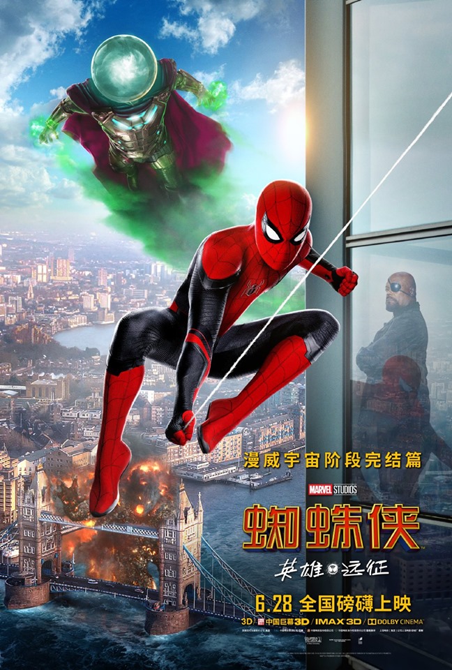
Here we have the Chinese version of the poster. Not sure whether it was made here in the States or by someone in the Orient, but either way, it's an awful, awful design.

The actual figures themselves aren't too awfully bad for once, and it appears that someone actually too the time to create a customized cityscape, rather than slapping down some uninspired clip art.

The problem here's with the composition. The title's wayyyyyyyy too small down there in the corner. Were they afraid of covering up London Bridge? The release date and other verbiage should all be drastically reduced in order to free up space for the title.

And why is there an acre of space at the top, just to the right of Mysterio? You could almost stick another poster in that real estate!

Lastly, what the holy hell is up with Nick Fury in this poster? As with every other Spider-Man: Far From Home poster, Sony desperately wanted to remind us that Samuel L. Jackson stars in the film. But there was a problem here. Nick Fury doesn't swing from webs or fly. So how do you include him in a layout that features characters cavorting a thousand feet off the ground?

The answer's simple! Create a non-existent 300 story building containing fifteen foot tall ceilings, and have him posing in front of a window just as Spidey & Misty swoop by! Never mind that the windows are somehow both translucent and reflective (which I suppose is possible, but unlikely), nobody'll ever think twice about it.

Congrats to Sony for another winning design!

Saturday, June 29, 2019

What Happened To The Art Of Movie Poster Design: Some Actual GOOD Examples!

For the past month or so I've been obsessively complaining about the sorry state of current movie poster design. 99% of it is pure, undiluted crap that would embarrass a first year art student. When I look at the artwork lining the walls of my local cineplex, I'm baffled as to how any of it was ever approved, much less printed and sent out for use.

Today I thought I'd try something different for a change, and present a precious few movie posters that are actually GOOD. Bear with me—  I'm a little rusty, as I'm not used to praising poster art. 

First up is the Japanese poster for Godzilla: King Of The Monsters. They went with an illustrated design here rather than photos, which is much appreciated. The four main monsters are all stylishly represented, as they're intertwined with what I assume is the film's title. Love the bold red background too. Kudos!

Next is this IMAX poster for Toy Story 4: The Unnecessary Sequel. The third film tied up the series with a perfect narrative bow, making this fourth outing nothing more than a shameless cash grab on Disney's part. 

That said, this is a damn fine poster. As I noted above, I love illustrated posters and would take one any day over a design cobbled together from a dozen photos.

I like the character designs here, that manage to capture the look of the 3D models in two dimensions. The predominantly purple/green color palette is an interesting choice, but it works. Well done, IMAX Toy Story 4 designer!

Lastly, I like this poster for Jim Jarmusch's arthouse zombie film The Dead Don't Die. It's incredibly simple, but effective. In particular I love the blue tint with the red fill light at the right, and as a graphic designer I'm a sucker for hand-drawn fonts. Great job!

Monday, June 24, 2019

What Happened To The Art Of Movie Poster Design: Spider-Man: Far From Home

Man, the hits, er, I mean the horribly designed movie posters just keep comin.' I don't know what the hell's going on, but so far Summer 2019 has a been an absolute goldmine of god-awful lobby art.

Nowhere is that more evident than with Marvel/Sony's upcoming Spider-Man: Far From Home. Apparently Sony must have had a "Bring Your Kid To Work Day," and one of their designers let their son or daughter take a crack at the Spider-Man ad campaign. 

Sony definitely went all out for this film. They didn't just stop at one bad design, they gave us a whole slate of 'em! And yes, I'm blaming Sony here, because Marvel Studios usually puts out decent posters.

First up we have this cobbled-together monstrosity. I kind of see what they were going for here, as the designer attempted to place the main characters over the spider symbol seen on Peter Parker's costume. Unfortunately it doesn't quite work, as the figures cover up way too much of the symbol and make it virtually unrecognizable. It ends up looking like they're posing in front of gigantic tuning forks. I'm sure it probably looked a lot better in the mind's eye of the designer.

The overly retouched faces are another added bonus. Tom Holland's currently twenty three, but looks about sixteen. I doubt there's a single wrinkle on his entire face, so why'd they feel the need for such extreme airbrushing? He looks like a plastic mannequin here.

And then there's the lighting, which illuminates the characters from three completely different directions. Nothing says "None Of These Actors Were In The Same Room When Their Photos Were Taken" like separate light sources! Professional!

Lastly, there's the clip art landmarks. Yes, I understand this is the purpose of clip art. But most artists try to customize it a bit, rather than just downloading an image and plopping it unchanged into their design.

Apparently the designer was so pleased with the way the first poster turned out that they decided to use it as a base for this second version. This time they place the figures inside a could of neon tube triangles for some reason. 

They reuse the three main figures here, although these versions aren't touched up as severely as the others, and end up looking much more natural. Apparently the designer had some dead space at the bottom, and decided to fill it haphazardly with a couple new characters. Note that once again, they're lit by completely different light sources. Hey, at least their incompetence is consistent.

And once again there's more clip art awkwardly inserted, to clumsily let us know the movie takes place in London.

And then there's this design. Jesus wept. I don't even know where to begin. It's... attention-grabbing, I'll say that for it. Of course one could have said the same thing about the Hindenburg explosion too, so...

I think maybe they were going for some kind of retro illustration vibe here, but sadly they failed miserably. Oddly enough the landmark line art isn't a terrible concept, but it's very poorly executed, as there's no apparent thought to how the elements are laid out.

As you might expect by now, once again we have three characters with three light sources. And apparently there's exactly ONE photo of Samuel L. Jackson as Nick Fury in the entire world, as they've used it on THREE different posters now. And how about that image of Jake Gylllllennnhaaaalll as Mysterio? Check out his thrilling action pose there, as he stands stock still, facing the camera as if he's at the DMV. Exciting!

You've heard the expression "Let's Throw Some Ideas At The Wall And See What Sticks?" This is the visual representation of that saying.

Credit where it's due— I don't actually mind this poster. It's a clever idea, playing on the old idea of travel stickers slapped on a suitcase, and the extreme closeup means there's not a lot they can screw up. I won't go so far as to say "well done," but I will say "reasonably adequate job."

Sunday, June 16, 2019

What Happened To The Art Of Movie Poster Design: Wonder Woman 1984

Sigh... Another day, another putrid movie poster. What the hell's going on over there in Hollywood's various design departments? Seems like there's been a veritable plague of god-awful designs in the past month or two. Case in point: This poster for the upcoming Wonder Woman 1984. 

In this sequel, Wonder Woman teams up with Winston Smith to overthrow the totalitarian regime of the Party, lead by none other than Big Brother himself. It's possible I may have misread the film's synopsis.

Nevertheless, look at this eye-searing abomination of a poster. Jesus Tapdancing Christ! Could they have shoehorned any more colors into the feckin' thing? I assume the mylar curtains are supposed to represent two Ws over and over, but my god... surely there was a less obnoxious way to go about it.

I assume since this movie's set in 1984, the "designer" is trying to evoke the look and spirit of that decade. Thing is, I lived through the 80s, and I don't remember ever seeing anything that looked even remotely like this.

I'll give it credit where it's due— it'll definitely stand out in the cineplex lobby, and draw everyone's eye. Of course once they see it, they'll immediately begin vomiting, but that's to be expected.

A quick check around the internet reveals that the vast majority of fans actually like this appalling advertisement! Holy crap! I was gobsmacked to learn this. What the hell is wrong with people? I feel like I'm been taking my crazy pills again!

I also notice that Wonder Woman's apparently been feminist-ized in this sequel. No longer does she wear the star-spangled bikini she's been sporting for nearly eighty years (!). Laws, no! That look was imposed on her by the evil Patriarchy. Mustn't allow nasty old white men to tell a strong, independent character like Wonder Woman how to dress! 

Instead she's now completely covered from the neck down by chain mail and armor (that still emphasizes her breast, by the way). Heck, why stop there? Why give icky old males anything to leer at? Stick a helmet on her head, and cover up her flattering features while you're at it!
Related Posts with Thumbnails
 
Site Meter