I have no idea who Jiff is; he's just a character I doodled one day.
This was sort of an experiment in using only two colors (not counting the white of the "paper"). How come drawing with two colors is harder than drawing with thousands?
This was also my first real attempt at hand-lettering a logo (the bottom sentence is typeset though). I'm fairly happy with the way it came out. Even though there are about 3 million fonts out there, sometimes you just can't find one that works for what you want to do.
The slightly off-register look was intentional. Just like a real printed piece!
Drawn in Photoshop on the graphic tablet.
Here's the original sketch of Jiff. As you can see, not a lot changed as far as the figure is concerned. A lot got added in the finished product though.
Sunday, May 31, 2009
Monocles® By Klink Of Düsseldorf
So I'm watching "Hogan's Heroes" and I think to myself, "Man, that Col. Klink is one dapper Nazi! What's the secret to his dashing and debonair style?" And then it hit me- the monocle!
Call me crazy, but I think the monocle is long overdue for a comeback. Any day now they're going to come back in style in a big way. And when they do, I've got a logo all ready to sell to the highest bidder.
This is one of those words that lends itself perfectly to a logo. The two Os become the eyes, and the N looks sort of like a nose if you squint. Unfortunately, cosmic convergences like this only happen in made-up logos, and never in the real world.
I'm wondering if I should make the O inside the monocle a little bigger than the other letters, as if it's being magnified? Or maybe I should just leave well enough alone.
Designed in InDesign.
Labels:
hogan's heroes,
klink,
monocle
Noseby
I drew this illustration, but for some reason just wasn't happy with it. I shelved it for a week or so, then came back to it. The nose cart was originally an angular affair with pads on either side of his nose. I changed it to the fancy wrought-iron model you see here, and then I was happy with it.
Drawn in Photoshop on the graphic tablet.
Labels:
illustration,
nosby,
nose
Bob Of The Dead
One of my all-time favorite movies is "Shaun of the Dead." It's the perfect blend of horror and comedy, which isn't easy to do. Plus it's got zombies in it, which automatically makes any movie a must see in my book. It's got shambling, slow-moving zombies too, mind you, not these new fangled fast running zombies. Isn't "fast zombie" an oxymoron? If not, then it should be.
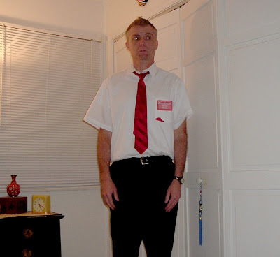
But I digest. 3 or 4 years ago I decided to dress up for Halloween at work, and went as Shaun. The option to wear a Halloween costume was one of the (very) few fun things the company tolerated. I wasn't going to bother with dressing up that year, but the day before Halloween I was walking through the local Walmart and spied a cheap polyester red tie. Having just watched SOTD just a few days earlier, I exclaimed out loud "That's the exact same tie that Shaun wore!" Ordinarily I would have been embarrassed at talking to myself in public, but since I was in Walmart, I blended right in with the other customers.
So I bought the tie and an even cheaper polyester short sleeve dress shirt. I came home and painted a red stain on the pocket of the shirt ("You've got red on you!"). I made an exact copy of Shaun's "Foree Electric" name tag on the computer (10 points if you know the significance of that name!), printed it out and stuck it in a name tag holder. I added all that to a pair of black pants, and Violin! Instant Shaun costume!
Sadly, as I started this project at the last possible minute, there wasn't time to make a bloodied cricket bat.
The next morning I dressed in my costume, put some "product" in my hair and styled it as much like Mr. Simon Pegg's as I could. I made a pretty good facsimile of Shaun, if I do say so myself. I strutted proudly into work, imagining all the accolades my costume would receive. My hopes were dashed when it turned out that only about 1% of my fellow employees recognized who I was supposed to be. Most of them guessed "Best Buy Salesperson." Even after I told them who I was, 3/4 of the rabble had never seen the movie. Sacrilege!
Maybe if I'd had the bloody cricket bat to complete the ensemble I would have been more easily recognized. I could also have used it to bludgeon in the head those who still didn't get it.
One thing I've always been curious about (well, not always, just since the SOTD movie came out): The official spelling of Shaun's name is "SHAUN." Given that it's a riff on Romero's classic "Dawn of the Dead," shouldn't his name be spelled "SHAWN?" Is that part of the joke? Do they not use the "SHAWN" spelling in Britain?
Bonus points if you know Shaun's last name in the movie!
Labels:
halloween,
shaun of the dead
Tuesday, May 26, 2009
Vitruvian Killdeath
Another day, another Dr. Killdeath drawing. This time it's the Doctor as if drawn by da Vinci. At last all those art history classes came in useful for something!
I played around with various Photoshop brushes until I found one that simulated ink strokes pretty well. It was a bear trying to get his hands to match up with the circle and square like the original drawing. Fortunately the Doctor is pretty flexible.
For the background I just used a splotchy Photoshop brush and painted until I thought it looked like parchment. I applied some kind of canvas texture to it in Photoshop too.
In case you're wondering, the text really does say something, but I doubt you can read it. It's the "Niagra Falls" routine that the Three Stooges (and many others) used to perform. You know: "Slowly I turned, step by step, inch by inch..." What's that? You've never heard of it? Then you sir, are a Philistine. Good day, sir. I SAID GOOD DAY SIR!
No particular meaning in using the "Niagra Falls" routine. I just needed some text to fill in the top and bottom like in the original drawing, and that popped into my head.
Drawn in Photoshop on the graphic tablet.
Here's the original "Vetruvian Man" for comparison.
Labels:
da vinci,
dr. killdeath,
illustration,
vitruvian
Farm Boy's Not Living Up To His Full Potential...
Every other day this truck parks in front of the Subway restaurant across the street from where I work. I just recently noticed the little slogan under their logo-- "Just A Little Better." C'mon, Farm Boy marketing department, you can do better than that. It's like you're not even trying. Most businesses would boast that they're better than everyone else, not that they're just slightly above average.
Here guys, I'll even help you out. How about, "Farm Boy: The Best You'll Ever Have," or "Farm Boy: Better Than You Deserve." Or how about "Farm Boy: Too Good For You."
Still and all, it's better than the Lance Snack Foods slogan: "I've Got Lance In My Pants." I swear to Thor, I am not making that one up.
Sunday, May 24, 2009
Armond
Luckily for Armond he has no apparent nose, which is a good thing when your armpits are right above your ears.
Drawn in Photoshop on the graphic tablet.
Labels:
armond,
illustration,
monster
Ginger Man
A few weeks ago I bought some fresh ginger root at the Chinese grocery. When I got it home I noticed this piece and thought it looked sort of like a little man. I couldn't bring myself to cut him up.
Hey, maybe he could become a new character in a drawing! He could be a little superhero who uses his ginger-based powers to reduce inflammation and relieve nausea.
Sadly, he was definitely at his best in the original photo. I thought maybe he'd dry out and I could save him indefinitely, but after about a month he shriveled into a gnarled little twig about one fourth his original size. Ginger Man, we hardly knew ye!
Thursday, May 21, 2009
Dr. Manhattan: From Sketch To Final Art
Here's a step by step guide to how I did my Dr. Manhattan drawing, if anyone's interested.
(Not shown: The part where I try to decide if I should go ahead and draw his wiener or not)
Step 4: I added each arm on a separate layer as well. This made the shading that's coming up in the next step easier to do. Note that his right arm is on a layer underneath his body.
Step 5: Then I added shading on yet another separate layer. Again, that makes it much easier to edit if I don't like the way it looks.
To do the shading I selected his body, then created a new layer. I then had a blank layer with a selection in the shape of his body. I used the brush to add the darker blue shading. Because I was painting inside a selection that was the exact shape as his body, the shading didn't slop over into the background (I hope all that makes sense). I repeated the process for each arm.
Step 6: Finally I added a shadow under his floating feet, an energy ball around his hand, and a scratchy painted background, all on additional layers. Layers are your friends, kids!
Step 1: Doc started out as a rough sketch that I scanned and placed into Photoshop.
Step 2: I used the sketch as a guide to draw the body on a new layer with the pen tool. Usually the characters I draw have an outline (like the sketch) but I went a different direction this time.
Step 3: Next I added details to his head and lower body (again with the pen tool instead of the usual brush) on a separate layer. Adding details to a separate layer makes it easier for me to make changes.
(Not shown: The part where I try to decide if I should go ahead and draw his wiener or not)
Step 4: I added each arm on a separate layer as well. This made the shading that's coming up in the next step easier to do. Note that his right arm is on a layer underneath his body.
Step 5: Then I added shading on yet another separate layer. Again, that makes it much easier to edit if I don't like the way it looks.
To do the shading I selected his body, then created a new layer. I then had a blank layer with a selection in the shape of his body. I used the brush to add the darker blue shading. Because I was painting inside a selection that was the exact shape as his body, the shading didn't slop over into the background (I hope all that makes sense). I repeated the process for each arm.
Step 6: Finally I added a shadow under his floating feet, an energy ball around his hand, and a scratchy painted background, all on additional layers. Layers are your friends, kids!
Labels:
dr. manhattan,
how to draw,
illustration,
watchmen
Dr. Manhattan
Here's an illustration I did of Dr. Manhattan from the "Watchmen" graphic novel and movie.
I first read the book way back when it came out in 1986, and have been a fan of it ever since. I've lost count of how many times I've read all or parts of it. I really liked the movie too. It's a brilliant adaptation, but I wonder if I would like it if I'd never read the book? I honestly can't tell.
Sadly the movie didn't do as well at the box office as the studio hoped it would. Maybe it'll find its audience on DVD. I suspect the general public didn't know what to make of it, and probably found it overly complicated and impenetrable. The lack of recognizable characters might have scared people away too. Even my mom knows who Batman and the Hulk are, but Rorschach and Ozymandias? Not so much.
If I had a dollar for every movie review that mentions Dr. Manhattan's penis, I could buy a Hi-Def TV and have enough left over to put a substantial dent in my mortgage. The way they go on about it you'd think IT was the star of the movie (and now I'm talking about it too. D'oh!). It's just a wiener, folks. Everybody's seen one before.
I wonder if DC Comics would be open to doing a Watchmen kid's book in this style? ;^)
Drawn in Photoshop on the graphic tablet.
Labels:
dr. manhattan,
illustration,
watchmen
Brainerd
Brainerd's just your average everyday alien with a big ol' brain, daydreaming about probing some humans.
Drawn in Photoshop on the graphic tablet.
Labels:
alien,
brainerd,
illustration
Wednesday, May 20, 2009
Dr. Killdeath's Little Golden Book
Here's the cover to the Dr. Killdeath Little Golden Book.
I loved Little Golden Books when I was a kid. I would have especially loved this one; it would have been right up my alley. Somehow I doubt the parents of today would be thrilled by a book with kill, death and doom in the title.
Maybe someday I'll tackle the inside of the book.
Drawn in Photoshop on the graphic tablet, on about 100 layers. The Doc was a pretty straightforward drawing, but his raygun gave me a lot of trouble. It went through about twenty different versions. I couldn't figure out how to draw it and still fill up the empty space above his head. Finally I got the bright idea to add the totally superflous Flash Gordon fin on the top.
The little icons at the left are from some horror dingbat font. I may have gone a little overboard on the aging. It's easy to do too much.
Labels:
dr. killdeath,
illustration,
little golden book
Dr. Killdeath Has A Snack
Like most of my illustrations, this one started out life as a doodle. He looked like he had some potential as a character, so he moved up to the majors.
Dr. Killdeath is just your basic dwarf mad scientist with a plexiglass flip top skull, dabbling in things man wasn't meant to know.
I went through a ton of names for him (Dr. Killsmash, Dr. Deathface, Dr. Totenkopf) before I finally settled on Dr. Killdeath. It's got a good rhythm.
Drawn in Photoshop on the graphic tablet.
Here's the original sketch of the Doctor. Not a lot of changes in the final drawing, mostly just smoothing out the lines.
Labels:
dr. killdeath,
illustration
Waiter!
A quick little drawing based on a doodle I did.
I need to redo him one of these days and make him lean forward more, to give a better impression of speed.
Drawn in Photoshop on the graphic tablet.
I need to redo him one of these days and make him lean forward more, to give a better impression of speed.
Drawn in Photoshop on the graphic tablet.
Labels:
illustration,
waiter
Monday, May 18, 2009
My Workspace
Here's a shot of my workspace, for the three people out there who might be mildly interested. Yep, this is where the magic happens!
It's set up in the corner of the spare bedroom that's become my office/studio. My house has three bedrooms, which if added together would make one normal sized bedroom for the average human adult.
Up until about a year ago I had a sad little pre-fab pressboard desk from Walmart. The way it was designed (with shelves in the front) prevented me from putting my legs under it, so whenever I did any work I had to sit "sidesaddle." It was as uncomfortable as it was embarrassing. This probably explains why I didn't do as much illustrating as I would have liked back then-- I couldn't sit for very long with my body twisted like that.
I also had what must have been one of the first 17" monitors ever made. It was a good 2.5 feet deep, and weighed at least 75 pounds. It also took up all the available real estate on the desk; the monitor was literally flush with the front of the desk. There was ZERO desk space available. I had to hold the keyboard in my lap.
So last year I decided enough was enough. I ditched the tiny desk and bought a glass top one. Since my office had limited space, I thought a desk that was virtually invisible wouldn't fill up the space visually. I also ditched the giant monitor and bought a new flat panel display.
Now I can actually draw with my legs under the desk, facing the same direction as my head. And with the flat panel monitor I actually have some desk space now. I wish I'd upgraded a long time ago.
From left to right, you can see the Asian inspired floor lamp (which isn't nearly as bright in real life as it appears here), a Simpsons character poster, a dogs playing poker poster (always a classic), an autographed photo of Yvonne Craig as Batgirl (growwwwl!), an autographed photo of B-movie actor John Agar (given to me by my pal Keith), and a drawing of Scrooge McDuck (sadly not drawn by Carl Barks). On the desk is a Dwight Shrute bobblehead on the left, and a tin windup robot on the right. My precious graphic tablet is on the pull out shelf below the desk, and the unholy tangle of cables and cords is at the bottom of the photo.
I bet you wouldn't have believed anyone could write so much about a freakin' desk, huh?
It's set up in the corner of the spare bedroom that's become my office/studio. My house has three bedrooms, which if added together would make one normal sized bedroom for the average human adult.
Up until about a year ago I had a sad little pre-fab pressboard desk from Walmart. The way it was designed (with shelves in the front) prevented me from putting my legs under it, so whenever I did any work I had to sit "sidesaddle." It was as uncomfortable as it was embarrassing. This probably explains why I didn't do as much illustrating as I would have liked back then-- I couldn't sit for very long with my body twisted like that.
I also had what must have been one of the first 17" monitors ever made. It was a good 2.5 feet deep, and weighed at least 75 pounds. It also took up all the available real estate on the desk; the monitor was literally flush with the front of the desk. There was ZERO desk space available. I had to hold the keyboard in my lap.
So last year I decided enough was enough. I ditched the tiny desk and bought a glass top one. Since my office had limited space, I thought a desk that was virtually invisible wouldn't fill up the space visually. I also ditched the giant monitor and bought a new flat panel display.
Now I can actually draw with my legs under the desk, facing the same direction as my head. And with the flat panel monitor I actually have some desk space now. I wish I'd upgraded a long time ago.
From left to right, you can see the Asian inspired floor lamp (which isn't nearly as bright in real life as it appears here), a Simpsons character poster, a dogs playing poker poster (always a classic), an autographed photo of Yvonne Craig as Batgirl (growwwwl!), an autographed photo of B-movie actor John Agar (given to me by my pal Keith), and a drawing of Scrooge McDuck (sadly not drawn by Carl Barks). On the desk is a Dwight Shrute bobblehead on the left, and a tin windup robot on the right. My precious graphic tablet is on the pull out shelf below the desk, and the unholy tangle of cables and cords is at the bottom of the photo.
I bet you wouldn't have believed anyone could write so much about a freakin' desk, huh?
Sunday, May 17, 2009
The All New Futureboy
From 1998 to 2001 I worked at a small animation company. While there I created a character I called Futureboy. In my outline, Futureboy was a silent little astronaut who worked in a bustling spaceport. He was always on the verge of being fired by his nervous boss, who would stick him in different jobs each week, hoping to find one he could do without getting into trouble.
My plan was for Futureboy to star in a series of animated shorts, 7 to 8 minutes in length. These shorts would play in movie theaters before the main feature, just like the old Warner Bros. cartoons did back in the 1930s through 1960s. That plan was probably a little too ambitious.
Unfortunately before any of this got off the ground, Fox came out with "Futurama" and did the whole future shtick way better than I ever could. After that there didn't seem to be much point in going forward with Futureboy (Get it? Forward? Future? I got a million of 'em!).
My original Futureboy design was stiff, complicated and hard to draw. I decided to dust him off and simplify/redesign him.
Drawn in Photoshop on the graphic tablet.
Here's the very rough sketch of the newly redesigned Futureboy.
I dug up an image of the original Futureboy. As I said earlier, he was stiff, complicated and hard to draw. Look at all those fussy little details on his spacesuit. There's way more stuff there than there needs to be. And his stubby little legs might look cute here, but it was next to impossible to draw or animate him in a walk cycle.
He was one of those characters that only looked good in one pose-- this one. As soon as you tried to turn him or have him move in any way, it was nearly impossible to draw him. He was due for a good overhaul.
This was most likely drawn in Flash, then imported into Photoshop where color was added. Yikes, would you look at that horrible line work! Every single line is the exact same weight. It makes me cringe just looking at it.
My plan was for Futureboy to star in a series of animated shorts, 7 to 8 minutes in length. These shorts would play in movie theaters before the main feature, just like the old Warner Bros. cartoons did back in the 1930s through 1960s. That plan was probably a little too ambitious.
Unfortunately before any of this got off the ground, Fox came out with "Futurama" and did the whole future shtick way better than I ever could. After that there didn't seem to be much point in going forward with Futureboy (Get it? Forward? Future? I got a million of 'em!).
Drawn in Photoshop on the graphic tablet.
Here's the very rough sketch of the newly redesigned Futureboy.
I dug up an image of the original Futureboy. As I said earlier, he was stiff, complicated and hard to draw. Look at all those fussy little details on his spacesuit. There's way more stuff there than there needs to be. And his stubby little legs might look cute here, but it was next to impossible to draw or animate him in a walk cycle.
He was one of those characters that only looked good in one pose-- this one. As soon as you tried to turn him or have him move in any way, it was nearly impossible to draw him. He was due for a good overhaul.
This was most likely drawn in Flash, then imported into Photoshop where color was added. Yikes, would you look at that horrible line work! Every single line is the exact same weight. It makes me cringe just looking at it.
Labels:
futureboy,
illustration
Law School on the Planet of the Apes.
I drew this YEARS ago, and in fact forgot it existed it until I was going through some old backup CDs. It's my little attempt at doing a "Far Side" type of comic (boy, do I miss the Far Side!).
If you're familiar with the "Planet of the Apes" movies then you might get a little chuckle out of it. If you're not familiar with them, then push yourself away from the magic computin' box and go watch them (the originals, not the *shudder* remake)!
It was probably drawn with pencil, inked, then scanned into Photoshop where gray tones were added. I think that's supposed to be my attempt at a "kewl" signature at the lower right. Either that or a spider crawled onto the scanner bed.
Labels:
far side,
illustration,
planet of the apes
Cosplayer: From Sketch To Final Art
Here's a drawing from beginning to finished piece, if anyone's interested.
Step 1: It started out as a rough doodle in my sketchbook, which I scanned into Photoshop.
Step 2: I adjusted the opacity of the sketch to around 20%. Then I created a new layer and drew the figure (on the graphic tablet) over the sketch. I then deleted the sketch layer.
Sometimes I keep the sketch layer for fun and just turn it off so that it's invisible.
Step 3: I adjusted the color of the lines, because I've found that adding color to them looks more interesting than having plain black outlines.
I also added the lightsaber blade. Note: If you want something to look glowly, make it white in the center and add color to the edges.
Step 4: I added color to the figure on a separate layer beneath the drawing. For this drawing I went with pale, washed-out colors instead of my usual eye-searing bright palette.
Not shown-- the part where I hide under the desk because the drawing's not turning out right and I tell myself I can't draw and I'm a fraud and everyone's going to find out.
Step 5: Then I added color to the background on a layer beneath the drawing and its color. Remember, kids, layers are your friend!
Step 6: Added aging effects, just because.
Labels:
how to draw,
illustration,
luke skywalker,
star wars
Cosplayer #1: Luke Skywalker
"Cosplay," if you didn't know, is short for "costume play (I pray that's what it means, anyway). You'll see this cosplayer and many more like him strolling around every comic book convention in the country, swinging their lightsabers, bow staffs and elven swords with reckless abandon, threatening the safety and eyeballs of innocent passersby in the crowded aisles.
He may not know what's appropriate to wear out in public, but you can rest assured he's got every excruciating detail of Luke Skywalker's ensemble down pat.
Drawn in Photoshop with the graphic tablet.
He may not know what's appropriate to wear out in public, but you can rest assured he's got every excruciating detail of Luke Skywalker's ensemble down pat.
Drawn in Photoshop with the graphic tablet.
Labels:
cosplay,
illustration,
luke skywalker,
star wars
Saturday, May 16, 2009
Mrs. Madge Canasta
Madge's hobbies are bingo, smoking, mah-jongg, monitoring the neighbors, smoking, telling her husband to stop slouching, tanning, asking her daughter when she's going to marry and smoking.
In my mind Madge has an alarmingly deep voice and sounds like she's from "New Yawk."
I used Kuler to come up with a suitable color scheme. Check it out, it's a cool little site.
Drawn in Photoshop on the graphic tablet.
In my mind Madge has an alarmingly deep voice and sounds like she's from "New Yawk."
I used Kuler to come up with a suitable color scheme. Check it out, it's a cool little site.
Drawn in Photoshop on the graphic tablet.
Labels:
illustration,
madge canasta
Struttin' In The City
A very, very, VERY quick little drawing I did while taking a break from another drawing. That's right, I draw while I'm drawing. Sad, innit?
Drawn in Photoshop with the pen tool. I was trying to make a character from the simplest shapes possible. For the first time in a long time it was not drawn with the graphic tablet, but with the plain old mouse.
I really need to come up with a better title for this one.
I also played around with the halftone filter to make it look like a printed piece.
Labels:
illustration,
vector
Snert
This is a character I've been doodling for years and years; since the 80s. When it came time to type in a title I realized this is the first time he's ever had a name.
Drawn in Photoshop on the graphic tablet.
Labels:
illustration,
monster
Lil' Barbarian
I kept messing with this drawing and no matter what I did I just wasn't satisfied with it. After struggling with it for a couple of days I increased the size of the ax to super ridiculous proportions and then it finally worked (well, for me anyway).
Drawn in Photoshop on the graphic tablet.
Here's the original sketch (yes, it was drawn on lined paper). This one changed quite a bit in the final drawing; he gained an open war-cry mouth, a more dynamic pose, and the aforementioned ridiculously large axe.
Drawn in Photoshop on the graphic tablet.
Here's the original sketch (yes, it was drawn on lined paper). This one changed quite a bit in the final drawing; he gained an open war-cry mouth, a more dynamic pose, and the aforementioned ridiculously large axe.
Labels:
barbarian,
conan,
conan the barbarian,
illustration
Thursday, May 14, 2009
Negative Yeti
Lately I've been fascinated by negative space, so I tried to do a drawing that was mostly not there.
The arms were kind of a happy accident that came to me while I was drawing.
Drawn in Photoshop on the graphic tablet.
The arms were kind of a happy accident that came to me while I was drawing.
Drawn in Photoshop on the graphic tablet.
Labels:
illustration,
monster,
negative space,
yeti
That's Good News For My Elbows
Wow. Aim high, Nick's!
This is a restaurant near my house. I've eaten there and their food's not bad; in fact their BBQ chicken pizza is pretty good. I can't say I noticed anything outstanding about the tables. Maybe I ate there after the new "No-Stick" policy was put into effect.
I'm positive that this was real and not a case of kids rearranging letters as a joke. For one thing the sign is high enough that said vandals would need a ladder, plus the message was up there for a good three weeks; ample time for the owner to notice and change it if it was a prank.
I'm no restaurateur, but if this was my place I think I might keep the news about the table viscosity on the down-low.
The Doctor
I'm a huge fan of the new Doctor Who series and I think David Tennant may be the best Doke-tah ever. Too bad he's leaving the show soon.
That's the sonic screwdriver the Doctor's holding there. When it was introduced back in the 1970s, he used it to lock and unlock doors. Over the years the sonic has grown more and more powerful until now it can do pretty much anything it needs to do. The Doctor still uses it to unlock doors, but now it can access & control computers, start cars and even darken the lenses of the Doctor's reading glasses and turn them into sunglasses (!).
Based on a doodle in my sketchbook, this was one of those illustrations that I thought would take no time at all. As usual, it ended up taking forever. You'd think by now I'd realize a drawing takes more than 15 minutes, but it seems to surprise me every time.
Drawn in Photoshop with the graphic tablet.
Here's the original sketch of the Doctor. Look closely and you'll see that his legs are a lot shorter here. I lengthened them quite a bit in the finished drawing to accentuate David Tennant's gangly frame.
Labels:
david tenant,
doctor who,
illustration
Wednesday, May 13, 2009
It's Dwayne, That I.T. Guy
Every company has at least one-- that I.T. Guy. Surly, lacking in social skills and possessing questionable hygiene. Oh, he'll fix your computer for you, but he doesn't have to like it. This I.T. Guy isn't based on anyone in particular, but is an amalgam of many I have known.
My real-life I.T. Guy Story: Waaay back when Photoshop 3 came out (the first version ever to have layers!!!) I asked the company I was working for at the time if I could order a copy for our department. They said no, it wasn't in the budget and I'd just have to make do with Photoshop 1.
Dejected, I walked down to the I.T. department to get a box of floppies (files used to fit on floppy disks, kids!). When The I.T. Guy opened his heavily-fortified supply closet to get them, I spied TEN brand-new shrink wrapped copies of Photoshop 3 sitting inside. Stunned by the sight of such a bounty, I asked if I could please have one and he said "Absolutely not." When I asked why, he said, "Because if I give you one then I'll only have NINE left!"
Bear in mind that my small department was the ONLY one in the company that did ANY sort of graphic work and would ever have any use for Photoshop; all the other departments worked strictly on spreadsheets and billing. Why the I.T. Guy had even ONE copy of Photoshop 3 in his secret closet, I have absolutely no idea. And he had TEN!
I ended up being a weasel and telling my supervisor about it and the I.T Guy had to grudgingly hand over a copy of Photoshop 3 to me after all. Was I a squealer? Yes. Did I hate myself for doing it? A little, but it was worth it, because at last I had my sweet, sweet layers.
Drawn in Photoshop with the graphic tablet.
Here's the original sketch for Dwayne. He didn't change a lot, other than gaining a right arm and his ever present coffee cup.
Labels:
computer,
illustration
Fauny McPanhooves
Just another character I doodled one day.
For some reason I originally drew Fauny with round ears. Something wasn't looking right to me, but I couldn't figure out what it was. I finally realized that all mythological creatures have pointed ears; it's the law in most countries. So I redrew his ears at the last minute and made 'em longer and pointier (shut up, SpellCheck).
I'm happy with the way the highlights in his hair came out.
Drawn in Photoshop with the graphic tablet.
Labels:
faun,
illustration,
pan
Business Guy
I messed with the background on this one for a long time, trying to get a 1950s cartoon look. While working on it I accidentally made one of the skyscraper layers transparent and liked the way it looked, so I made the rest of the layers transparent as well.
Drawn in Photoshop with the graphic tablet.
Labels:
business man,
illustration
Count Gothula
Another drawing based on a doodle I drew.
As usual I struggled to come up with a suitable background. After many trials and much error I found a Photoshop brush that simulated watercolors pretty well, and drew a bloody background for the Count.
Drawn in Photoshop on the graphic tablet.
Here's the original sketch for the Count. Not a lot of changes, other than cleaning up the sloppy lines and fixing his lopsided head (in my defense this copy of the sketch is larger than actual size-- the original is about an inch high).
Labels:
illustration,
vampire
Subscribe to:
Posts (Atom)